Color Management | i1Display Pro

Check out an i1Display Pro from the IC to correct the color on your monitor, tablet, or mobile device. 

If this is your first time calibrating your computer, download the i1Profiler application from the X-Rite website and install it onto your computer by clicking HERE

Open the .dmg package and follow the prompts on screen for installation. Installation will include a computer restart.

Profiling Your Device

i1display pro box
Before you begin

Ambient light affects profiling outcomes. Set your computer in a place you plan to work often. 

Make sure your screen has been on for 20-30 minutes. Turn off any settings that could possibly change the normal temperature or brightness of the screen while in use. (i.e. Night Shift, Low Power Mode, Screen Saver, etc.)

Don’t forget to clean your monitor so that it is free from fingerprints!

Quit any applications and turn off all settings that might interfere with calibration, such as pop up notifications, flashing updates or messaging services. 

In System Preferences, ensure the following preferences are set:

system preferences - display
Displays > Uncheck “Automatically Adjust Brightness” 
system preferences - accessibility
Accessibility > Display > Set Contrast Slider to “Normal
system preferences - energy saver
Energy Saver > Uncheck any power savers that would affect the calibration process

Calibrating Your Monitor

i1profiler - main page

Open the i1Profiler software & connect the calibrator to your computer using the USB cord.

User Mode > Basic 

Application Settings > set the Default display device to i1Display

From the Workflow Selector (left column), select the Display Profiling button.

Display Settings

i1profiler - display settings

Select the display you are profiling and the type of monitor. In most cases, the program will automatically select it for you.

White Point > CE Illuminant D65

Luminance > 120 cd/m2

Gamma > Standard (default) | 2.20

Uncheck > Adjust profile based on my ambient light

Select the Next button

Note: D50 and D65 are the most common temperatures. D50 is a warmer white used for commercial CMYK printing (IC laser printing) and imitates the yellow-cast of paper. D65 is cooler in color and is best for inkjet printers (IC inkjet printing). D65 is also a good setting for photography and digital output. If you are undecided, use D65.

80 cd/m2 is the lowest level and 250 cd/m2 the brightest. 80-120 are the preferred luminance levels to see shadows. If you prefer to keep your current screen brightness level, select “Native.” The program will retain your current level of screen brightness and profile accordingly. If you are unsure, 100-120 is recommended.

Display Hardware Setup

i1profiler - measure color patches

If your computer has Automatic Display Control (ADC), check the ADC box. If you are unsure, undecided, or know your computer does not have ADC, use the manual mode.

Check > Adjust brightness, contrast, and RGB gains manually.

Select > Start Measurement

Measurement

i1profiler - brightness adjustment

Place the measurement device onto your screen using the counterweight provided on the USB cord.

Follow the instructions on the screen to adjust your brightness. Get as close as you can; the brightness is usually not a perfect match, but the device will calibrate according to your brightness.

The computer will then flash different colors and the spectrophotometer will calibrate based on these colors.

When prompted by the program, remove the i1Display device from the screen, turning the diffuser back over the lens.

i1profiler - final measurement comparison

Once finished, the program will display a series of patches split into before and after triangles. Each triangle pair should only differ in value. If any pair are a completely different color, it is likely that a screen pop up interfered with the calibration process, and the measurements must be taken again.  

If the patches are correct, click Next or select ICC Profile.

i1display pro - final page

Name your profile; include date and monitor type. Example: 2018-01-30-Macbook-Office.icc

Set user access for the profile. 

Set up a Profile Reminder of 1-4 weeks. If you are doing color-critical work, profile every week. Otherwise, every 2-4 weeks should be sufficient. 

before and after monitor calibration

You can view results and select “before” and “after” images as examples of your improved color.

Color Management | Converting a Color Profile

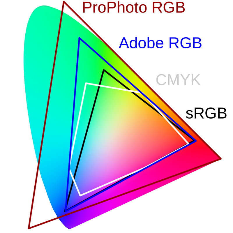
By converting a color profile, the color numeric numbers change. Converting your color profile permanently moves your image into that color space. It is the last step prior to saving the file for print.

Converting A Color Profile

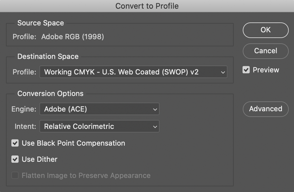
Edit menu > Convert to Profile.

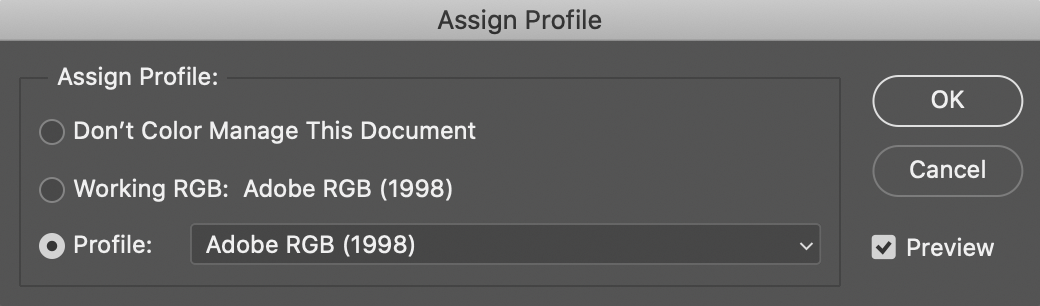
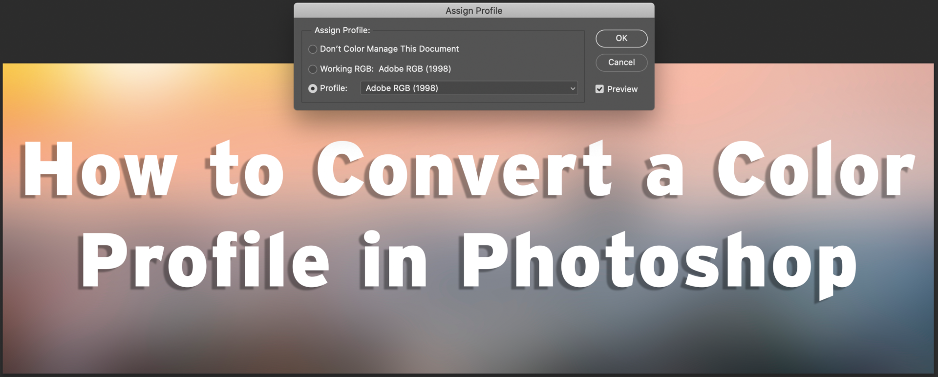
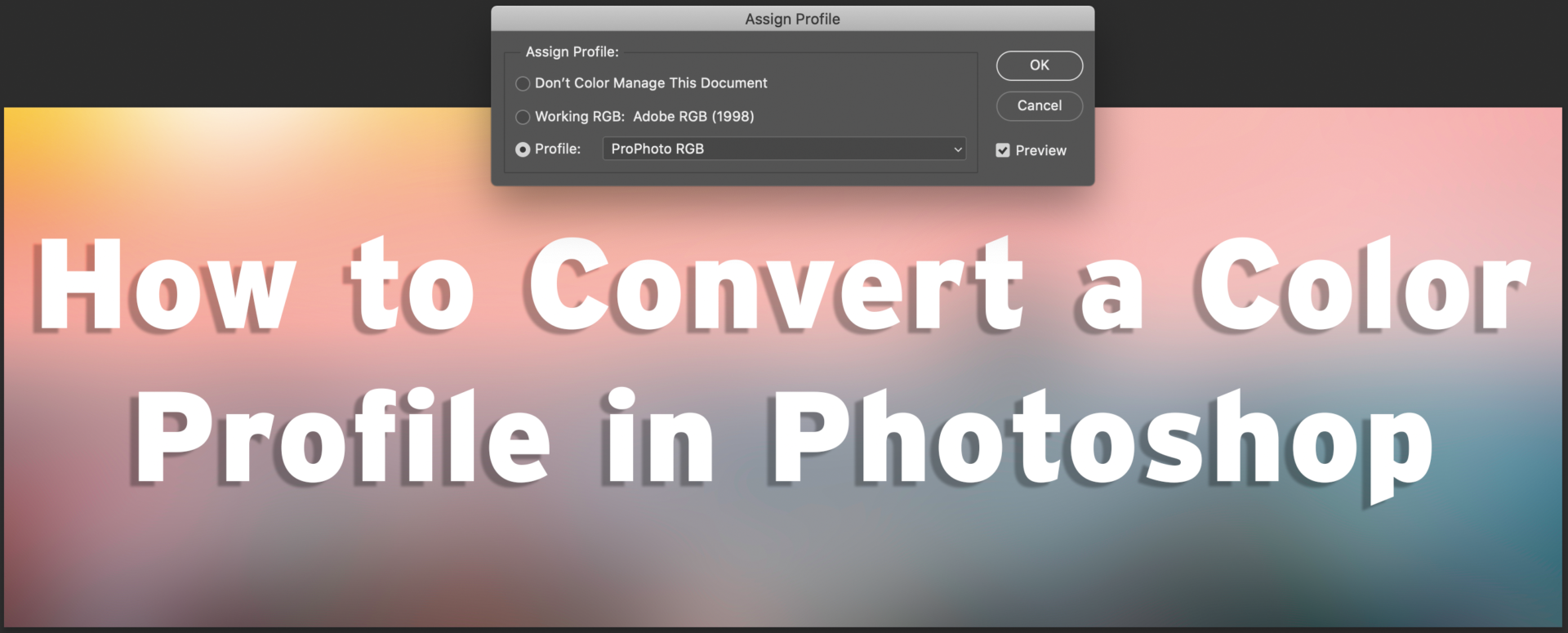
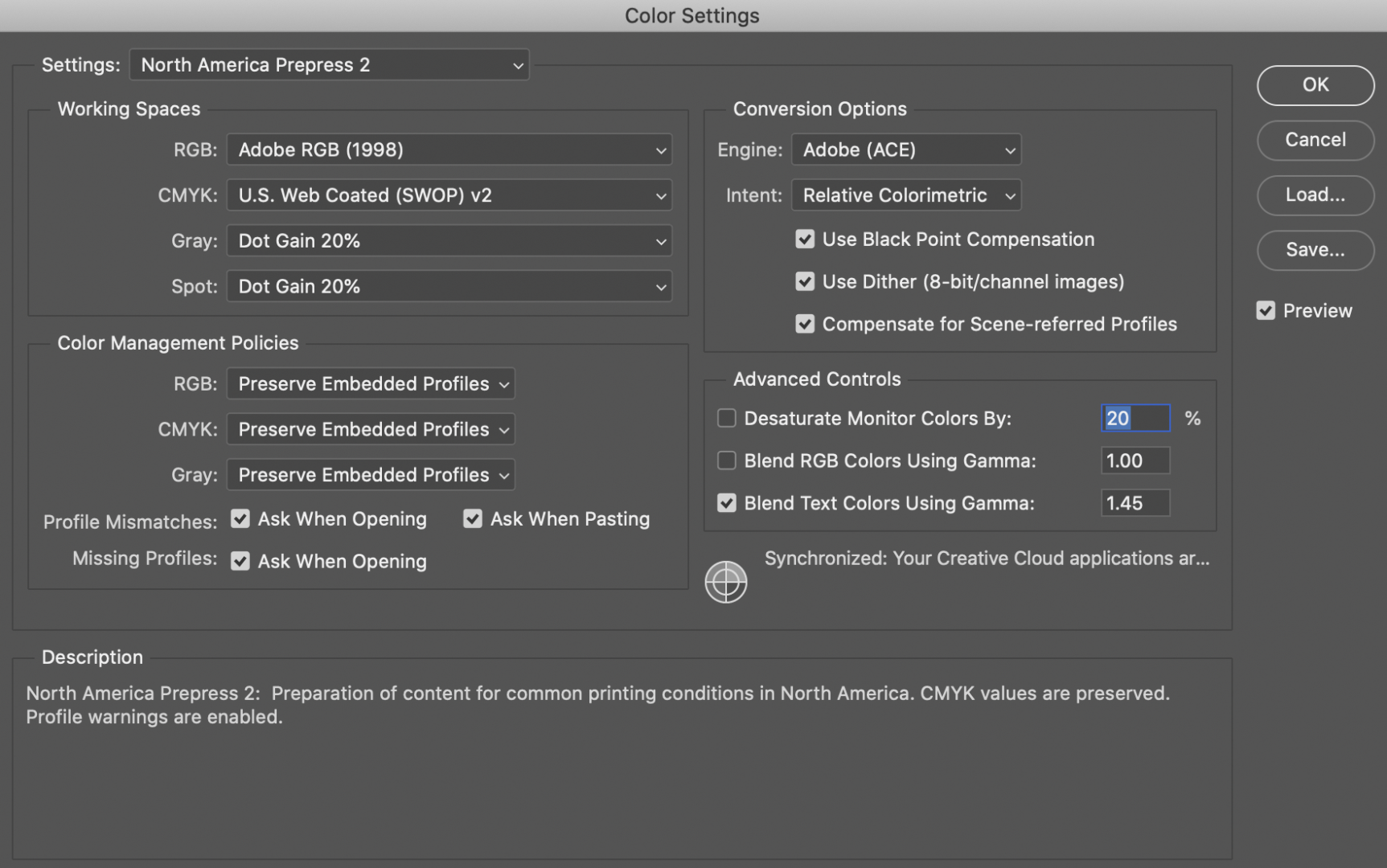
Under Destination Space, choose the color profile to which you want to convert the document’s colors. Under Conversion Options, specify an engine and a rendering intent.

Toggle on the Preview option.  Click OK.

What is a rendering intent?

A rendering intent is a method or set of instructions for mapping or translating color values from one color space to another, generally when converting from a color space with a larger gamut to one with a smaller gamut.

Absolute Colorimetric:

Leaves colors that fall inside the destination gamut unchanged. Out-of-gamut colors are clipped. This intent aims to maintain color accuracy at the expense of preserving relationships between colors and is suitable for proofing to simulate the output of a particular device. 

Relative Colorimetric:

Compares the extreme highlight of the source color space to that of the destination color space and shifts all colors accordingly. Out-of-gamut colors are shifted to the closest reproducible color in the destination color space. Relative Colorimetric preserves more of the original colors in an image than Perceptual. This is the standard rendering intent for printing in North America and Europe. The Imaging Center’s RIP is also set to use this rendering intent.

Perceptual:

This method may shift all colors slightly in order to retain the tonal and color relationships throughout the image. It may sacrifice absolute color accuracy, but it is good for preserving tonality and natural hues in an image. Good for photographs. This is the standard rendering intent for the Japanese printing industry.

Saturation:

This method maps saturated colors in the source space to fully saturated colors in the destination space at the expense of tonality and color accuracy. This is only good for “business presentation” type applications where bright saturated colors are more important than the exact relationship between colors.

For More Information

Adobe: Color management settings for the best print output
LinkedIn Learning: Understanding Rendering Attempts


Color Management | Assigning a Color Profile

Assign Profile allows you to tag an image with a specified profile or untag an image by removing it. No color numeric conversions are made; it simply applies an interpretation to the numbers in the image.

Photoshop - Assign Profile. Adobe RGB

Edit menu > Assign Profile. 

Toggle on the Preview option. You will most likely see the colors shift on screen. 

In the Assign Profile dialog box you will see three options:

Don’t Color Manage This Document
Removes the existing profile from the document. After you remove the profile from a document, the appearance of colors is defined by the application’s working space profiles.

Working [color model: working space]
Assigns the working space profile to the document. 

Profile
Selecting this option allows you to toggle between different color profiles. Adobe assigns the new profile to the document without actually converting colors to the profile space. This may dramatically change the appearance of the colors as displayed on your monitor.

Examples of Different Profiles

Notice in the examples below – how the colors appear richer or duller depending on which profile you are assigning the image.

Example of sRGB
sRGB

sRGB is a color space that defines a range of colors that can be displayed on-screen and in print. It is the most widely used color space and is supported by most operating systems, software programs, monitors, and printers

Example of Adobe RGB
Adobe RGB (1998)

The Adobe RGB color space is a color space developed by Adobe in 1998. It was designed to encompass most of the colors achievable on CMYK color printers, but by using RGB primary colors on a device such as a computer display

Example of ProPhoto RGB
ProPhoto RGB

The ProPhoto RGB color space is an output referred RGB color space developed by Kodak. It offers an especially large gamut designed for use with photographic output in mind. Most printers cannot achieve some colors of this gamut and may not print as bright.

Example of CMYK
CMYK

The CMYK color model is a subtractive color model, based on the CMY color model, used in color printing, and is also used to describe the printing process itself. CMYK refers to the four ink plates used in some color printing: cyan, magenta, yellow, and key

For More Information

LinkedIn Learning: Understanding Color Management
Adobe: Keeping Colors Consistent

Color Management | An Introduction

The print process starts as soon as you create a file. It is a good idea to set your color preferences before starting to work. A color space is a range of possible colors.

The IC works in both an Adobe RGB 1998 and U.S. Web Coated CMYK (SWOP) v2 color space.   

What is a Color Space?

rgb vs cmyk vs prophoto

color space in general is a set of colors that has been defined in some way. Typically they are colors that a given device is able to display or print.

The set of all the colors that can be found in a given color space is called its gamut. If a color is outside of this range and thus for example cannot be displayed or printed, we say it is out of the gamut

How to Change your Color Settings

Photoshop - Color Management | Prepress 2
How to Change your Color Settings in Photoshop

Edit menu > Color Settings 
Settings > North America Prepress 2

Do not change the color space by toggling between RGB and CMYK via Image menu > Mode. You will lose critical pixel data by using this method.

Adobe Bridge: North American Prepress 2
How to Change your Color Settings in Adobe Bridge

It’s good practice to synchronize your color settings in Adobe Bridge.

With Bridge open, do the following:

Edit menu > Color Settings 
North America Prepress 2 > Apply

For More Information

Adobe: Keeping Color Consistent
Linkedin Learning: Understanding Color Management

Quick Tip #1

To streamline the printing process, please combine multiple like-sized PDF (or .jpg) files into one single PDF file. 

Option 1

File > Create > Combine Files into a Single PDF

Please note, the Imaging Center cannot print a PDF portfolio. 

Acrobat - Combine Files
Option 2

Select the Add Files button in the left-hand corner of the Combine Files dialog box. In this dialog box, you will be able to select additional files to be included in the combined PDF. 

You can drag and drop files to make sure that the files are in the correct page order.

Select the largest file size via the icons within the Options menu located in the center of the dialog box. 

Select Combine. 

Video Tutorial

IC Quick Tip | Combining Multiple Files into a Single PDF file

Convert Color to Grayscale in Photoshop

In order to qualify for black & white pricing on the plotter printer (Epson T5270D), your image must first be converted to grayscale. If your image is submitted in color, you will be charged for the color price.

For the best results, you should always work from a duplicate file. You don’t want to toggle back and forth between different color spaces (especially on an original file) as you can lose critical pixel data. 

Before converting images, it’s best to do the following: 

  • Do as much editing as possible in the original color mode
  • Save a backup copy before converting. Be sure to save a copy of your image that includes all layers so that you can edit the original version of the image after the conversion.
  • Flatten the file before converting it. The interaction of colors between layer blending modes changes when the mode changes.
Open file in Photoshop
Image menu > Mode > Grayscale
Click Discard

Photoshop converts the colors in the image to black, white, and shades of gray.

NOTE: The technique above minimizes file size but discards color information and can convert adjacent colors to the exact same shade of gray. Using a Black & White adjustment layer increases file size but retains color information, letting you map colors to shades of gray.

For more information, check out

helpx.adobe.com/photoshop/using/converting-color-modes.html

Convert Color to Grayscale in Illustrator

In order to qualify for black & white pricing on the plotter printer (Epson T5270D), your image must first be converted to grayscale. If your image is submitted in color, you will be charged for the color price.

For the best results, you should always work from a duplicate file. Illustrator preserves editing capabilities but to keep yourself organized, it’s in best practice to save a separate grayscale IC print file.

Illustrator - Select All Objects
Open file in Illustrator
Select all of the objects whose colors you want to convert.

To select all objects in a file, choose 

Select > All. (To deselect all objects, choose Select > Deselect)

Illustrator - Unlock All
Don’t forget to unlock all layers & objects on your artboard! 

Object menu > Unlock All

Illustrator - Edit Colors - BW
Edit menu > Edit Colors > Convert To Grayscale
Illustrator - grayscale

NOTE: Use the Edit > Edit Colors > Adjust Colors command to convert objects to grayscale and adjust the shades of gray at the same time.

Your Illustrator file is now ready to save as a PDF file! Happy printing 🙂

For more information, check out

https://helpx.adobe.com/illustrator/using/adjusting-colors.html

Convert Color to Grayscale in Adobe Acrobat

In order to qualify for black & white pricing on the plotter printer (Epson T5270D), your image must first be converted to grayscale. If your image is submitted in color, you will be charged for the color price.

Sophie and Bubba
Open PDF file in Acrobat

Select Print Production from the toolbar on the right

Preflight Menu
Select Preflight
Acrobat - Preflight
Pull down the Essentials tab & select Prepress, Color, and Transparency
Acrobat - Preflight Menu
Choose Convert to Grayscale from the Convert Colors menu  

Select Analyze and Fix

Adobe will prompt you to save your file and a Save As PDF dialog box appears. 

Save your file with a unique name. 

Acrobat - Green Check
Once you select Save, Adobe will convert your file.

If there are no issues, you will receive a green checkmark .

For more information, check out

https://www.prepressure.com/pdf/basics/editing/convert-color-to-grayscale