DesignPLUS Select All

The Select All tool allows you to add ungraded, interactive learning checks directly to any Canvas content page. Similar to a “Multiple Answer” question in Canvas Quizzes, it presents a prompt and asks students to choose all the correct responses from a provided list. These options can be text-based, image-based, or a combination of both.

warning

Note

Because these are intended as informal self-checks, Select All activities have no connection to the Canvas Gradebook. However, anonymous usage data can be tracked. Review the DesignPLUS Interactive Data guide for more information.

Example Uses:

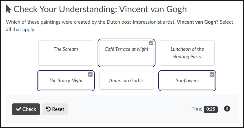
  • Art: Selecting all the works of art created by a specific artist from a gallery of images.
  • History & Humanities: Identifying which quotations belong to a specific historical figure.
  • Procedures & STEM: Selecting the first three steps required to complete a specific process or experiment.
A screenshot displays a "Select All" interactive check on a Canvas LMS content page, titled "Check Your Understanding: Vincent van Gogh" and preceded by a mouse cursor icon. Bold-faced instructions ask students to select all paintings created by Vincent van Gogh from a grid of six option buttons containing painting titles: "The Scream", "Café Terrace at Night", "Luncheon of the Boating Party", "The Starry Night", "American Gothic", and "Sunflowers". Three options—"Café Terrace at Night", "The Starry Night", and "Sunflowers"—are currently selected, indicated by dark purple borders and checkbox icons with white checkmarks, while the other three remain unselected in grey boxes. At the bottom, a grey-background control panel contains a black "Check" button with a checkmark icon, a grey "Reset" button with an arrow icon, and a status display showing "Time: 0:25" and an information icon.

Adding a Select All Activity to a Content Page

While editing content in your Canvas course, launch the DesignPLUS Sidebar by clicking on the 🚀 rocket ship icon at the top right corner of the screen.

  • Alternatively, press Alt/Option + Shift + D on your keyboard.

Place your cursor in the RCE (Rich Content Editor) where you want to add the Select All interface.

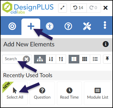
In the DesignPLUS Sidebar, click on the ➕ Add New Elements tab.

Click the Select All button (found under the Interactive Exercises or Recently Used Tools headings).

  • Alternatively, use the Search textbox to search for Select All. DesignPLUS will show results in real-time. Click the ✖️ icon to clear your search.
A screenshot of the DesignPLUS Sidebar demonstrates accessing the 'Select All' tool. An initial arrow points to the 'Add New Elements' tab in the top navigation bar, which features a large plus sign and is the currently active view. Within the 'Add New Elements' panel, two other arrows highlight the primary methods for finding the tool: one points to the 'Search' input field, and the other points directly to the 'Select All' button, which features an icon of a mouse cursor arrow, has a green diagonal ribbon reading "NEW" across its top-left corner, and is located in the 'Recently Used Tools' list. Other un-highlighted tools like 'Question', 'Read Time', and 'Module List' are also visible nearby.

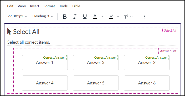
After clicking on the Select All button, that interface will be added to the RCE.

Keep in mind the following as you make edits:

  • The Select All interface may not look exactly like what you and your students will see after the page is saved. This is by design.
  • The Select All and Select all correct items text shown below can be edited directly in the RCE.
A screenshot of the Canvas LMS Rich Content Editor in edit mode shows the visual structure and configuration of a DesignPLUS "Select All" interaction. The entire element is enclosed in a dotted purple border with a pink "Select All" tag. A large mouse cursor icon sits next to the title "Select All," with the instruction "Select all correct items." below it in its own container. An "Answer List" section, also tagged in pink, displays a 3x2 grid of six placeholder rectangular blocks labeled "Answer 1" through "Answer 6." Above the first three blocks ("Answer 1," "Answer 2," and "Answer 3"), a green dotted outline with the text "Correct Answer" identifies these as the correct options for the interaction, while the remaining three blocks are unmarked. The partial Canvas RCE toolbar is visible at the very top.

Content Panel

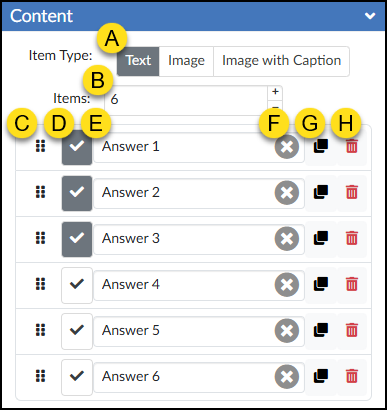
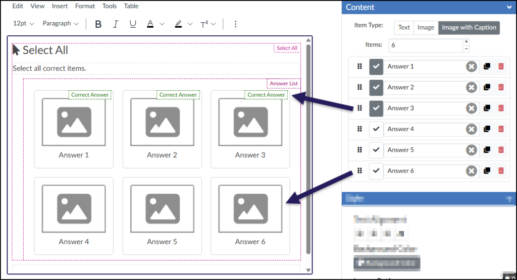
Use the Content panel to set up your answer choices, enable the option to add images, and determine which options are correct.

  1. Item Type: Choose whether your answer options will display as Text, Image, or Image with Caption.
    • Note on Images: If you select “Image” or “Image with Caption,” use the Canvas Rich Content Editor (RCE) toolbar to replace the placeholder images. The text you enter into the Answer Text Box will automatically become the alternative text (alt text) for that image, which is essential for screen reader accessibility.
  2. Items: Set the total number of options displayed to students. Use the and buttons to quickly add or remove answer rows.
  3. ⋮⋮ Reorder: Click and drag the six-dot handle up or down to rearrange the order of your answer options.
  4. ☑️ Checkbox: Toggle this box to mark an answer as correct or incorrect (checked = correct, unchecked = incorrect).
  5. Answer Text Box: Type in the text for a possible answer.
  6. ✖️ Clear Text: Click this icon to quickly delete all text from that specific Answer Text Box.
  7. Duplicate Item: Create an exact copy of the selected answer row.
  8. 🗑️ Delete Item: Remove the selected answer option from your question entirely.
A screenshot displays the detailed view of the "Content" panel from the DesignPLUS "Select All" tool, presented as a collapsible expander with a blue header. Below the header, callout 'A' indicates the 'Item Type' control with segmented buttons, showing 'Text' selected, over 'Image' and 'Image with Caption'. Callout 'B' points to the 'Items' input field, which shows '6' and has adjacent '+' and '-' buttons for changing the count. Below this are six horizontally-aligned rows of controls, one for each answer item. Each row, described from left to right, features: a drag handle icon (Callout 'C'), a checkbox icon (Callout 'D'), a text field for the answer content with an embedded clear content 'X' icon (Callouts 'E' and 'F' respectively), a duplicate icon (Callout 'G'), and a red trash can delete icon (Callout 'H'). The checkboxes (Callout 'D') are checked for the first three rows—labelled 'Answer 1', 'Answer 2', and 'Answer 3'—indicating these are the correct answers, while the checkboxes for the last three rows—labelled 'Answer 4', 'Answer 5', and 'Answer 6'—are unchecked.

In the Canvas RCE, correct options are marked with a green ‘Correct Answer’ label, while incorrect options remain unlabeled.

A screenshot displays the DesignPLUS Sidebar within the Canvas LMS interface, specifically focusing on the expanded "Content" panel for the "Select All" tool on the right. Inside this panel, the "Item Type" is set to "Image with Caption" (highlighted), and the "Items" count is set to 6. A list below shows six answer items, "Answer 1" through "Answer 6," each with standard DesignPLUS controls. The checkboxes for the first three items ("Answer 1," "Answer 2," and "Answer 3") are checked (darkened borders), identifying them as correct answers, while the next three items remain unchecked. To the left, the Canvas Rich Content Editor (RCE) displays the "Select All" interaction layout, including the title and a grid of six placeholder items. Two dark arrows prominently connect the sidebar configuration to the RCE: one arrow runs from the checked "Answer 3" row in the sidebar to the corresponding "Answer 3" placeholder in the RCE (which features a green dotted "Correct Answer" border); another arrow runs from the unchecked "Answer 6" row in the sidebar to the "Answer 6" placeholder in the RCE.

Style Panel

Use the Style panel to customize the appearance of your Select All activity on the Canvas page. The specific formatting options available here will change depending on the Item Type you selected in the Content panel.

Text
Image
Image with Caption
A screenshot of the "Style" configuration panel within the DesignPLUS Sidebar. The panel features multiple sections: "Text Alignment" with four icon buttons; a "Background Color" button with a paint palette icon; "Image Ratio" presented as a grid of buttons, with an clear icon and "4:3" (selected) on the top row, and "5:7", "3:4", and "4:5" on the bottom row; "Controls Corners" with segmented buttons for "Square" (selected) and "Rounded"; and "Controls Outline" with buttons for "None" (selected) and "Outline". The panel ends with three unchecked checkboxes labeled "Hide the solution from students", "Hide the controls from students", and "Hide the timer from students".
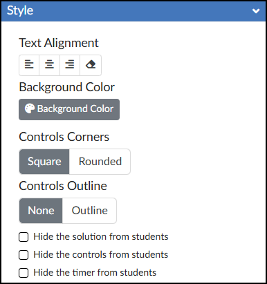
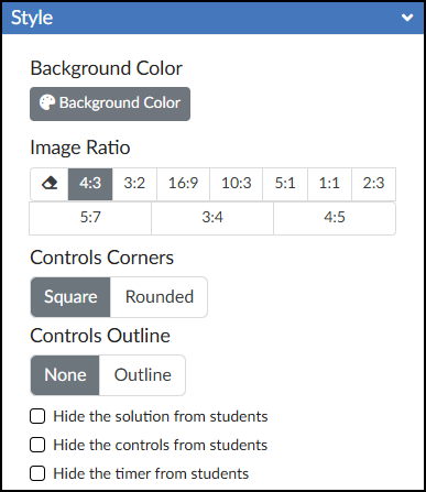
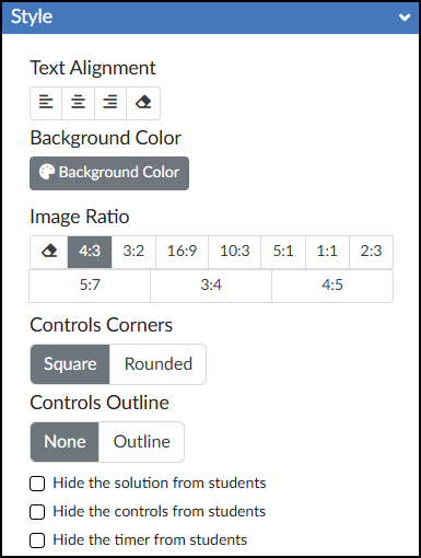
  • Text Alignment: Choose to align your text to the Left, Center, Right, or revert to the Default alignment.
  • 🎨 Background Color: Set the background color displayed behind the possible answers in your Select All activity.
  • Image Ratio: Define the aspect ratio for all images used within the activity.
  • Controls Corners: Choose Square or Rounded corners for the control bar at the bottom of the activity (which houses the ✔️ Check button, Reset button, and timer).
  • Controls Outline: Select Outline to add a border around the entire Select All interface and the bottom control bar, or select None to leave it borderless.
  • ☑️ Hide the solution from students: Check this box to prevent the “Solution” button from appearing after students check their answers.
  • ☑️ Hide the controls from students: Check this box to hide the ✔️ Check button, Reset button, and timer entirely.
  • ☑️ Hide the timer from students: Check this box to hide only the timer in the bottom right corner of the activity.

Advanced Panel

The Advanced panel contains additional settings for your Select All activity that can modify the way it functions for your students.

A screenshot of the 'Advanced' configuration panel for the 'Select All' tool within the DesignPLUS Sidebar, integrated in the Canvas LMS. The panel has a blue title bar and a white body. At the top of the body is a label reading 'Data Tracking Title' above a single-line text input field pre-filled with 'Select All 1'. Below the text box is a vertical list of four unchecked checkboxes, with labels from top to bottom that read: 'Disable data tracking for this interactive', 'Show feedback when 100% correct', 'Show feedback when incorrect', and 'Hide "Next" until all interactives completed'.
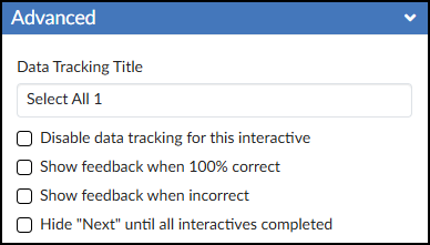
  • Data Tracking Title: Enter a custom name to track anonymous usage data for this specific activity. (Review the DesignPLUS Interactive Data guide for more information.)
  • ☑️ Disable data tracking for this interactive: Check this box to opt out of collecting anonymous usage data for this specific tool.
  • ☑️ Show feedback when 100% correct: Check this box to provide a custom success message. Selecting this adds a green placeholder box in the Rich Content Editor (RCE) where you can type your feedback.
  • ☑️ Show feedback when incorrect: Check this box to provide a custom “try again” message. Selecting this adds a red placeholder box in the RCE where you can type your feedback.
  • ☑️ Hide “Next” until all interactives completed: Check this box to hide the Canvas “Next” button at the bottom of the page until the student successfully completes the activity.

Additional Resources

Portions of this guide were created in collaboration with generative AI to brainstorm and refine ideas and grammar.