The Match Items tool allows you to add ungraded, interactive learning checks directly to any Canvas content page. Similar to a “Matching” question in Canvas Quizzes, it asks students to pair associated words, images, or a combination of both. You can present these matching activities in three different ways:
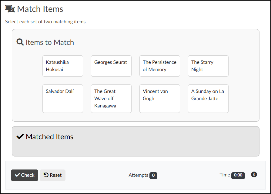
- Single Pool: All items are jumbled together on the screen.
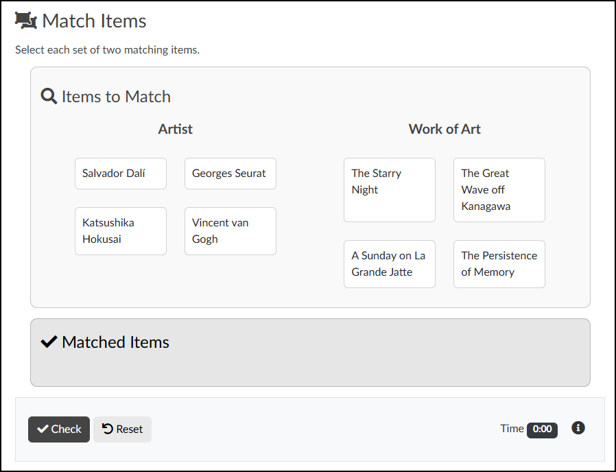
- Two Columns: Items are separated, requiring students to match a prompt from one column to an answer in the other.
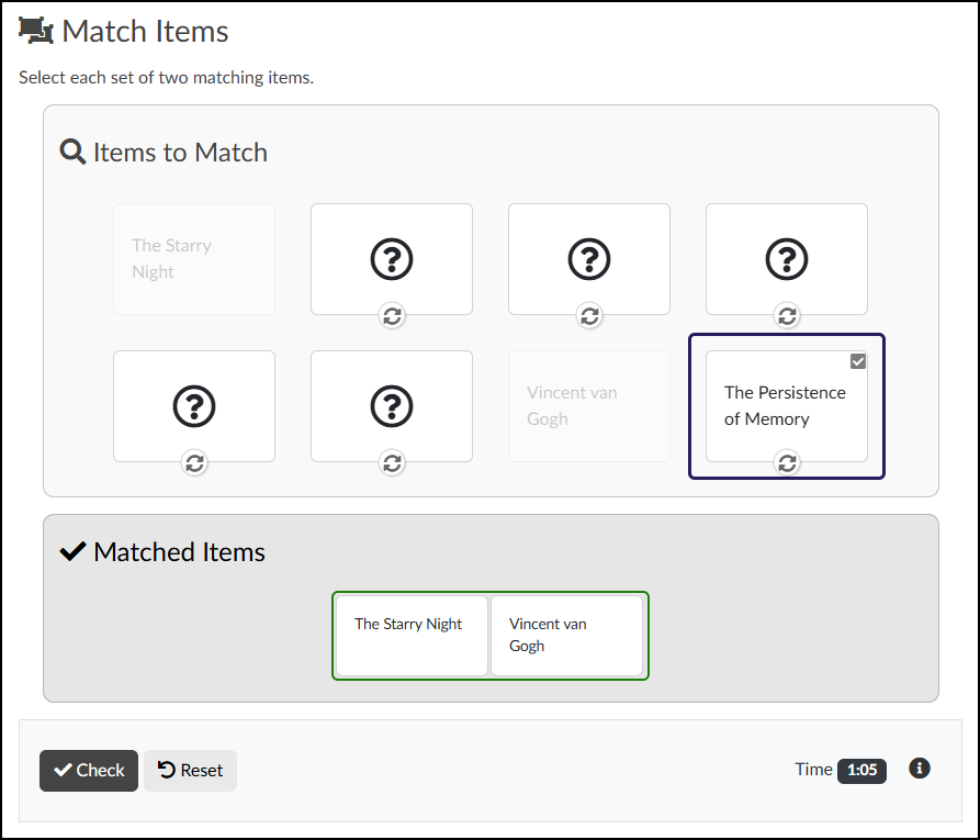
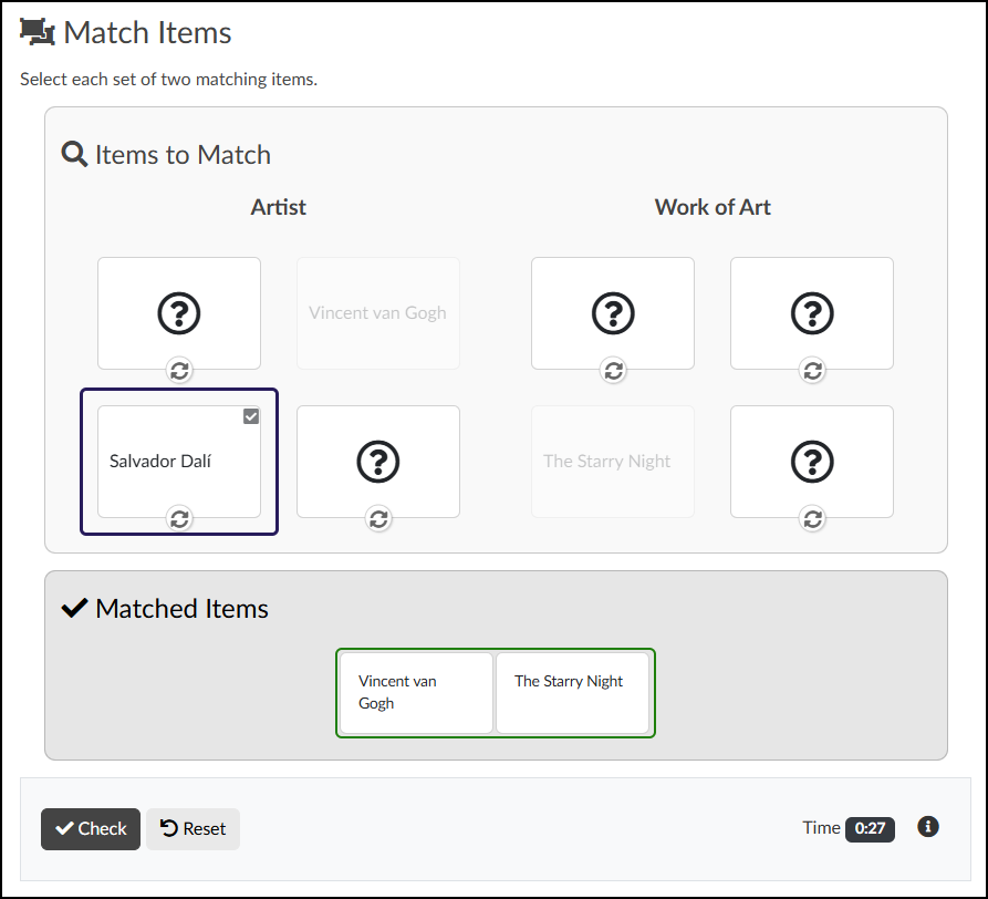
- Memory Game: Items are hidden as clickable “flip cards,” and students must uncover and match the mixed-up pairs. The “flip cards” can be displayed either in a single pool or two columns as described above.
Example Uses:
- Stage Directions (Single Pool): Provide a stage diagram image with highlighted zones and have students match them to terms like “Upstage Left,” “Downstage Right,” or “Center Stage.”
- Artist to Masterpiece (Two Columns): Students match an image of a famous artwork (e.g., The Starry Night) to the text name of its creator (e.g., Vincent van Gogh).
- Movement Identifiers (Memory Game): Students flip cards to match an art movement’s name (e.g., “Cubism,” “Surrealism”) to an image that exemplifies that style.
View examples of matching activity layouts by interacting with the image slider below. You can navigate between the examples using the arrows on either side, or by selecting the dots at the bottom.
- Adding a Match Items Activity to a Content Page
- Content Panel
- Style Panel
- Advanced Panel
- Additional Resources
Adding a Match Items Activity to a Content Page
While editing content in your Canvas course, launch the DesignPLUS Sidebar by clicking on the 🚀 rocket ship icon at the top right corner of the screen.
- Alternatively, press Alt/Option + Shift + D on your keyboard.
Place your cursor in the RCE (Rich Content Editor) where you want to add the Match Items interface.
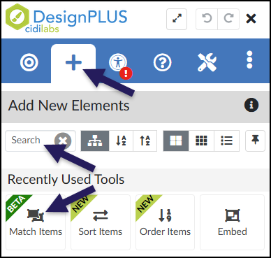
In the DesignPLUS Sidebar, click on the ➕ Add New Elements tab.
Click the Match Items button (found under the Interactive Exercises or Recently Used Tools headings).
- Alternatively, use the Search textbox to search for Match Items. DesignPLUS will show results in real-time. Click the ✖️ icon to clear your search.
- If you don’t see the Match Items button, you likely need to enable Beta Tools in your DesignPLUS settings. For step-by-step instructions, see Enable Beta Tools in DesignPLUS.
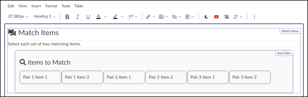
Clicking the Match Items button inserts the activity interface directly into your Rich Content Editor (RCE). As you build your activity, keep these key points in mind:
- Editing Pairs: You must use the Content panel within the DesignPLUS Sidebar to add, remove, or change your matching items.
- Authoring View vs. Student View: The interface in the RCE will look slightly different than the final published page. This is intentional and designed to make the building process easier!
- Customizing Text: You can click directly into the RCE to type over the default title (“Match Items”) and instructions (“Select each set of two matching items.”).
Content Panel
Use the Content panel to set up your pairings, enable the option to add images, and separate terms/definitions into columns.
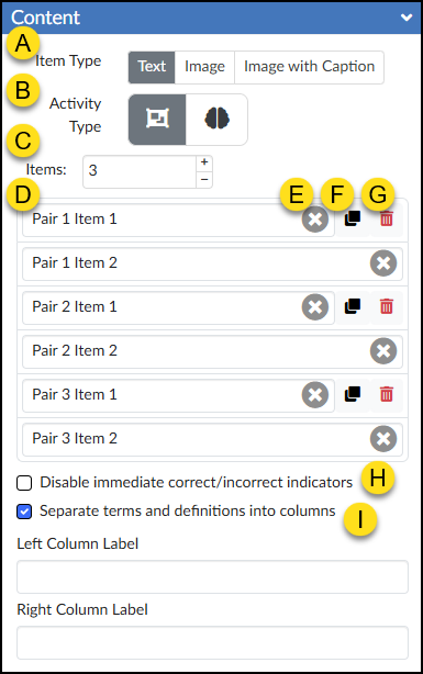
- Item Type: Choose whether your clickable items will display as Text, Image, or Image with Caption.
- Activity Type: Select the layout for your activity: Pairing (overlapping squares icon) or Memory (brain icon).
- Items: Set the total number of matching pairs. Use the ➕ and ➖ buttons to quickly add or remove pairing rows.
- Pairing Text Box: Type or edit the text for each specific item in a pair.
- ✖️ Clear Text: Click the gray ‘x’ icon inside a text box to quickly erase its contents.
- Duplicate Item (Copy Icon): Create an exact copy of the selected pairing row.
- 🗑️ Delete Item: Permanently remove the selected pairing row.
- Disable immediate correct/incorrect indicators: Check this box to allow students to match all items first and then check their answers at the end. (Note: This is only available for the “Pairing” activity type).
- Separate terms and definitions into columns: When checked, your pairs will be separated into two distinct columns. This reveals two new text fields—Left Column Label and Right Column Label—allowing you to create custom column headers for your students.
Style Panel
The Style panel allows you to customize the Match Items interface. These options update dynamically based on your “Item Type” selection in the DesignPLUS Content panel, and can include the ability to:
- Adjust text alignment, image ratios, and background colors.
- Modify the corners and outlines of the interface controls.
- Hide specific elements from students, such as the solution, controls, or timer.
If the Item Type is set to ‘Text’ in the Content panel, the following options become available in the Style panel:
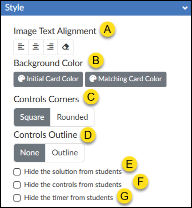
- Image Text Alignment: Choose to align your text to the Left, Center, Right, or revert to the Default alignment.
- 🎨 Background Color: Set the background color for the Initial Card Color and/or the Matching Card Color in your Match Items activity.
- Controls Corners: Choose Square or Rounded corners for the control bar at the bottom of the activity (which houses the ✔️ Check button, Reset button, and timer).
- Controls Outline: Select Outline to add a border around the entire Match Items interface and the bottom control bar, or select None to leave it borderless.
- ☑️ Hide the solution from students: Check this box to prevent the “Solution” button from appearing after students check their answers.
- ☑️ Hide the controls from students: Check this box to hide the ✔️ Check button, Reset button, and timer entirely.
- ☑️ Hide the timer from students: Check this box to hide only the timer in the bottom right corner of the activity.
![An annotated screenshot of the expanded "Style" accordion panel for the "Match Items" tool in the Canvas LMS DesignPLUS Sidebar. The panel features a blue header titled "Style" with a downward-pointing arrow indicating it is open, and is divided into several labeled sections using yellow lettered circles (A through G). Label A points to the "Background Color" section, which includes buttons with palette icons for "Initial Card Color" and "Matching Card Color." Label B indicates the "Image Ratio" grid of options, featuring an eraser icon to clear formatting, followed by various aspect ratios (4:3 [selected], 3:2, 16:9, 10:3, 5:1, 1:1, 2:3, 5:7, 3:4, and 4:5). Label C shows the "Controls Corners" section with "Square" (selected) and "Rounded" toggle buttons. Label D shows the "Controls Outline" section with "None" (selected) and "Outline" toggle buttons. Finally, labels E, F, and G correspond to three stacked, unchecked checkboxes at the bottom reading "Hide the solution from students," "Hide the controls from students," and "Hide the timer from students," respectively.](http://campus.collegeforcreativestudies.edu/ed-tech/wp-content/uploads/sites/53/2026/03/DesignPLUS_MatchItems_StylePanel2.png)
![An annotated screenshot of the expanded "Style" accordion panel for the "Match Items" tool in the Canvas LMS DesignPLUS Sidebar. The panel features a blue header titled "Style" with a downward-pointing arrow indicating it is open, and is divided into several labeled sections using yellow lettered circles (A through H). Label A marks the "Image Text Alignment" section, featuring buttons for left align, center align, right align, and an eraser icon for 'Default Align'. Label B points to the "Background Color" section with two buttons showing palette icons for "Initial Card Color" and "Matching Card Color." Label C indicates the "Image Ratio" grid of options, which includes an eraser icon to clear formatting followed by various aspect ratios (4:3 [selected], 3:2, 16:9, 10:3, 5:1, 1:1, 2:3, 5:7, 3:4, and 4:5). Label D shows the "Controls Corners" section with a toggle switch set to "Square" rather than "Rounded." Label E shows the "Controls Outline" section with a toggle switch set to "None" rather than "Outline." Finally, labels F, G, and H correspond to three stacked, unchecked checkboxes at the bottom reading "Hide the solution from students," "Hide the controls from students," and "Hide the timer from students," respectively.](http://campus.collegeforcreativestudies.edu/ed-tech/wp-content/uploads/sites/53/2026/03/DesignPLUS_MatchItems_StylePanel3.png)
Advanced Panel
The Advanced panel contains additional settings for your Match Items activity that can modify the way it functions for your students.
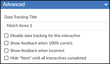
- Data Tracking Title: Enter a custom name to track anonymous usage data for this specific activity. (Review the DesignPLUS Interactive Data guide for more information.)
- ☑️ Disable data tracking for this interactive: Check this box to opt out of collecting anonymous usage data for this specific tool.
- ☑️ Show feedback when 100% correct: Check this box to provide a custom success message. Selecting this adds a green placeholder box in the Rich Content Editor (RCE) where you can type your feedback.
- ☑️ Show feedback when incorrect: Check this box to provide a custom “try again” message. Selecting this adds a red placeholder box in the RCE where you can type your feedback.
- ☑️ Hide “Next” until all interactives completed: Check this box to hide the Canvas “Next” button at the bottom of the page until the student successfully completes the activity.
Additional Resources
Portions of this guide were created in collaboration with generative AI to brainstorm and refine ideas and grammar.