Flip Cards provide an engaging, interactive way to present information on your Canvas pages. You can add text, images, or other content to both sides of the card. A circular arrows icon (🔄️) naturally prompts students to click and “flip” the card to reveal the information on the back.
Example Uses:
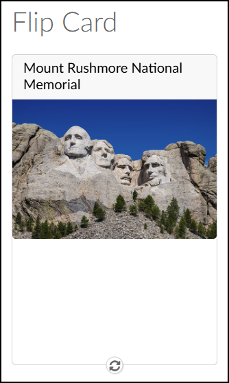
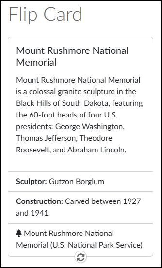
- Art & Humanities: A portrait of an artist on the front, with a short biography on the back.
- STEM: A chemical compound’s name on one side, and its corresponding formula on the other.
- Geography & History: A photo of a historical site on the front, revealing its global location and significance on the back.
Adding Flip Cards to a Content Page
While editing content in your Canvas course, launch the DesignPLUS Sidebar by clicking on the 🚀 rocket ship icon at the top right corner of the screen.
- Alternatively, press Alt/Option + Shift + D on your keyboard.
Place your cursor in the RCE (Rich Content Editor) where you want to add the Flip Card interface.
In the DesignPLUS Sidebar, click on the ➕ Add New Elements tab.
Click the Flip Card button (found under the Page Layout, Interactive Content, or Recently Used Tools headings).
- Alternatively, use the Search textbox to search for Flip Cards. DesignPLUS will show results in real-time. Click the ✖️ icon to clear your search.
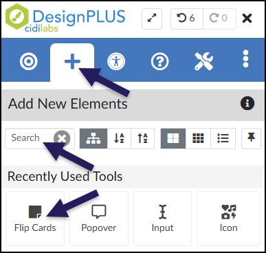
After clicking on the Flip Cards button, that interface will be added to the RCE.
- While editing your content page, the Flip Cards interface may not look exactly like what you and your students will see after the page is saved. This is by design.
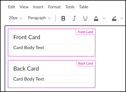
The Front Card/Back Card and Card Body Text shown below can be edited directly in the RCE.
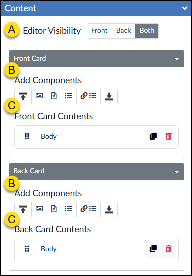
Content Panel
A new Flip Card automatically includes editable default text. To create richer content, you can easily add other components to the front and back of the card.
- Editor Visibility: Use the Front, Back, or Both buttons to control which part of the Flip Card you see while editing in the RCE. This allows you to tuck one side out of the way so you can concentrate entirely on building the other.
- Add Components: Six components are available to add to each side of your Flip Card.
- Header
- Image
- Body
- List
- Link List
- Footer
- Front Card Contents / Back Card Contents: These areas show the order of components added to the front/back of your Flip Card. They also include the following icons:
- Rearrange (six vertical dots): Use this icon to drag components up/down within the front/back of the Flip Card.
- Duplicate Contents: Make a copy of the chosen component.
- 🗑️ Delete Contents: Delete the component from the front/back of the Flip Card.
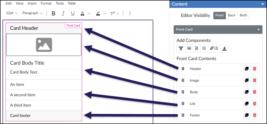
In the below example, additional components have been added under the Content panel of the DesignPLUS Sidebar. Each of those components are reflected in the same order within the RCE.
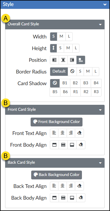
Style Panel
The Style panel provides additional options to configure the look of your Flip Card.
- The Overall Card Style sub-panel includes options to set the Width, Height, Position, Border Radius, and Card Shadow.
- The Front Card Style/Back Card Style sub-panel include the same set of icons for Front/Back Background Color, Text Align, and Body Align.