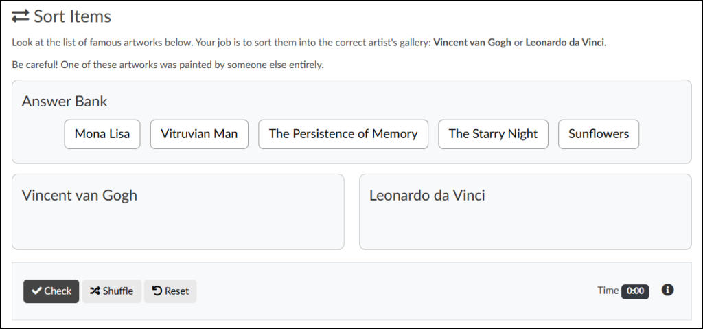
The Sort Items tool allows you to embed ungraded, interactive knowledge checks directly into any Canvas content page. Similar to a “Categorization” question in Canvas New Quizzes, students respond to a prompt by sorting given items into specific target categories.
Key Features:
- Flexible Formats: Items in the Answer Bank can be text-based, image-based, or a combination of both.
- Added Difficulty: You can challenge students by including “distractors”—options that do not belong in any of the categories.
Example Uses:
- Thematic Grouping: Sorting contemporary pieces into specific thematic categories (e.g., identity, environmentalism, globalization) based on the visual narrative or artist statements.
- Era Identification: Sorting historical posters or editorial layouts into their proper design eras, such as Bauhaus, Art Deco, Swiss Style, or Postmodernism.
- Lens Selection: Sorting photographs into categories based on the camera lens used to shoot them (e.g., macro, wide-angle, telephoto) by analyzing the depth of field and distortion.
- Adding a Sort Items Activity to a Content Page
- Content Panel
- Style Panel
- Advanced Panel
- Additional Resources
Adding a Sort Items Activity to a Content Page
While editing content in your Canvas course, launch the DesignPLUS Sidebar by clicking on the 🚀 rocket ship icon at the top right corner of the screen.
- Alternatively, press Alt/Option + Shift + D on your keyboard.
Place your cursor in the RCE (Rich Content Editor) where you want to add the Sort Items interface.
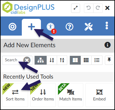
In the DesignPLUS Sidebar, click on the ➕ Add New Elements tab.
Click the Sort Items button (found under the Interactive Exercises or Recently Used Tools headings).
- Alternatively, use the Search textbox to search for Sort Items. DesignPLUS will show results in real-time. Click the ✖️ icon to clear your search.
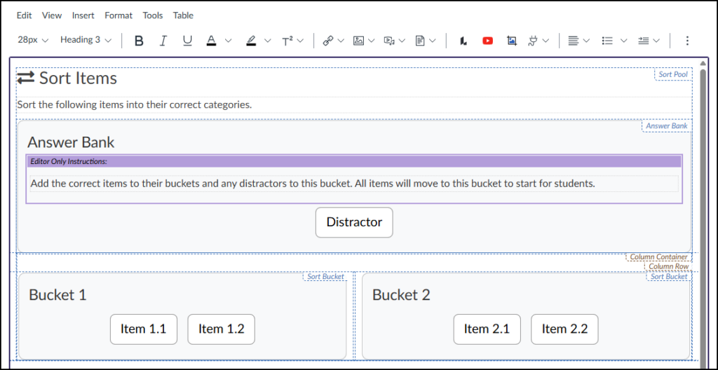
Clicking the Sort Items button inserts the activity interface directly into the Rich Content Editor (RCE). As you build your activity, keep the following in mind:
- Edit View vs. Student View: The interface in the RCE will look slightly different from the final published page. This is by design to make authoring easier.
- Direct Text Editing: You can click directly into the RCE to type over the default title (“Sort Items”) and instructions (“Sort the following items into their correct categories.”).
- Hidden Instructor Notes: The purple “Editor Only Instructions” box contains helpful authoring reminders. This box and its contents are completely invisible to students.
- Editing Buckets and Items: You must use the Content panel in the DesignPLUS Sidebar to change bucket names, correct items, and distractors.
Content Panel
The Content panel is where you manage your sorting activity by adding, editing, or deleting buckets, items, and distractors. Because this panel is context-sensitive, the settings it displays will dynamically update depending on where you click your cursor within the RCE.
The panel is organized into three main hierarchical areas:
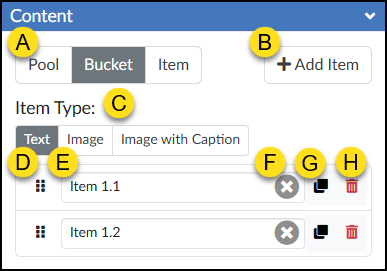
- The Pool: The overarching container for the entire activity. This includes the main question, the answer bank, the target buckets, and all draggable items.
- A Bucket: A specific category container within the Pool where students will drag and drop their correct answers.
- An Item: The individual draggable answers (including distractors) that belong inside a specific bucket or the answer bank.
Pool
As long as the Pool tab (A) is active, these configuration options will remain available regardless of where your cursor is placed within the activity in the editor.
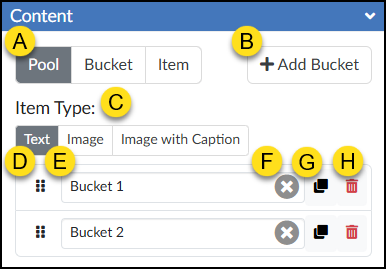
- Tool State (Pool, Bucket, Item): Switch between configuring the overarching Pool, specific Buckets, or individual Items.
- ➕ Add Bucket: Add a new target category for students to sort their answers into.
- Item Type: Choose whether your draggable options will display as Text, Image, or Image with Caption.
- Note: The option selected here applies to all items and distractors in the activity.
- ⋮⋮ Reorder: Click and drag the six-dot handle up or down to rearrange the order of the buckets.
- Bucket Text Box: Type or edit the display name for each bucket.
- ✖️ Clear Text: Click this icon to quickly erase the text from that specific bucket’s text box.
- Duplicate Bucket: Create an exact copy of the selected bucket row.
- 🗑️ Delete Bucket: Permanently remove the selected bucket from the activity.
Bucket
When the Bucket tab (A) is active, its settings are context-sensitive. The configuration options will only display if your cursor is placed directly inside a specific bucket or the Answer Bank within the RCE. If you click outside of these areas (such as on the main activity instructions), the panel will hide the settings and display the warning message: “Select a bucket to see its items.”
- Tool State (Pool, Bucket, Item): Switch to the Bucket tab to manage the individual items (answers) assigned to a specific bucket.
- ➕ Add Item: Click to add a new correct answer to the currently selected bucket.
- Item Type: Choose whether your draggable options will display as Text, Image, or Image with Caption.
- Note: The option selected here applies to all distractors or items within the selected bucket.
- ⋮⋮ Reorder: Click and drag the six-dot handle up or down to rearrange the order in which distractors or items appear within this bucket.
- Item Text Box: Type or edit the text for the specific answer option.
- Note: If you selected “Image” in the Pool settings, this will be an image upload/selection field instead.
- ✖️ Clear Text: Click the ‘x’ icon to quickly erase the text from that specific distractor’s or item’s text box.
- Duplicate Item: Create an exact copy of the selected distractor or item row.
- 🗑️ Delete Item: Permanently remove the selected distractor or item from this bucket.
Item
When the Item tab (A) is active, its settings are context-sensitive. The configuration options will only display if your cursor is placed directly inside a specific bucket or the Answer Bank within the RCE. If you click outside of these areas (such as on the main activity instructions), the panel will hide the settings and display the warning message: “Select an item to edit.”
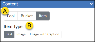
- Tool State (Pool, Bucket, Item): Select the Item tab to manage the specific properties of an individual answer or distractor.
- Item Type: Choose whether this specific draggable option will display as Text, an Image, or an Image with Caption.
- Note: Unlike the global settings in the Pool tab, changes made here apply only to the single item or distractor you currently have selected.
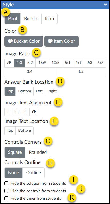
Style Panel
The Style panel allows you to customize the Sort Items interface by adjusting colors, repositioning the answer bank, and hiding specific controls. These options update dynamically based on your selections in the Rich Content Editor (RCE) and the DesignPLUS Content panel.
Pool
Text
If ‘Pool’ is selected and the Item Type is set to ‘Text’ in the Content panel, the following options become available in the Style panel:
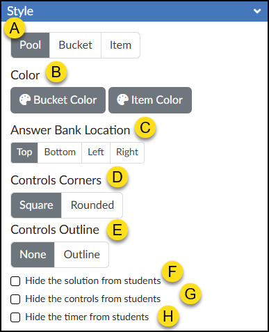
- Tool State (Pool, Bucket, Item): Switch between configuring the overarching Pool, specific Buckets, or individual Items.
- Color: Choose custom colors for your Buckets and Items using the 🎨 Bucket Color and 🎨 Item Color color pickers.
- Answer Bank Location: Select Top, Bottom, Left, or Right. The Answer Bank will automatically update in the RCE based on your selection.
- Controls Corners: Choose Square or Rounded corners for the control bar at the bottom of the activity (which houses the ✔️ Check button, Shuffle button, Reset button, and timer).
- Controls Outline: Select Outline to add a border around the entire Sort Items interface and the bottom control bar, or select None to leave it borderless.
- ☑️ Hide the solution from students: Check this box to prevent the “Solution” button from appearing after students check their answers.
- ☑️ Hide the controls from students: Check this box to hide the ✔️ Check button, Reset button, and timer entirely.
- ☑️ Hide the timer from students: Check this box to hide only the timer in the bottom right corner of the activity.
Image
If ‘Pool’ is selected and the Item Type is set to ‘Image’ in the Content panel, the following options become available in the Style panel:
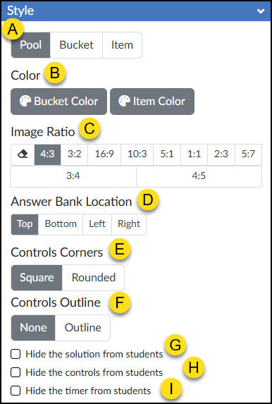
- Tool State (Pool, Bucket, Item): Switch between configuring the overarching Pool, specific Buckets, or individual Items.
- Color: Choose custom colors for your Buckets and Items using the 🎨 Bucket Color and 🎨 Item Color color pickers.
- Image Ratio: Define the aspect ratio for all images used within the activity.
- Answer Bank Location: Select Top, Bottom, Left, or Right. The Answer Bank will automatically update in the RCE based on your selection.
- Controls Corners: Choose Square or Rounded corners for the control bar at the bottom of the activity (which houses the ✔️ Check button, Shuffle button, Reset button, and timer).
- Controls Outline: Select Outline to add a border around the entire Sort Items interface and the bottom control bar, or select None to leave it borderless.
- ☑️ Hide the solution from students: Check this box to prevent the “Solution” button from appearing after students check their answers.
- ☑️ Hide the controls from students: Check this box to hide the ✔️ Check button, Reset button, and timer entirely.
- ☑️ Hide the timer from students: Check this box to hide only the timer in the bottom right corner of the activity.
Image with Caption
If ‘Pool’ is selected and the Item Type is set to ‘Image with Caption’ in the Content panel, the following options become available in the Style panel:
- Tool State (Pool, Bucket, Item): Switch between configuring the overarching Pool, specific Buckets, or individual Items.
- Color: Choose custom colors for your Buckets and Items using the 🎨 Bucket Color and 🎨 Item Color color pickers.
- Image Ratio: Define the aspect ratio for all images used within the activity.
- Answer Bank Location: Select Top, Bottom, Left, or Right. The Answer Bank will automatically update in the RCE based on your selection.
- Image Text Alignment: Select Align Left, Align Center, Align Right, or Default Alignment (the eraser icon) to revert to the default setting.
- Image Text Location: Select Top or Bottom. The text above or below each image in the RCE will update based on your selection.
- Controls Corners: Choose Square or Rounded corners for the control bar at the bottom of the activity (which houses the ✔️ Check button, Shuffle button, Reset button, and timer).
- Controls Outline: Select Outline to add a border around the entire Sort Items interface and the bottom control bar, or select None to leave it borderless.
- ☑️ Hide the solution from students: Check this box to prevent the “Solution” button from appearing after students check their answers.
- ☑️ Hide the controls from students: Check this box to hide the ✔️ Check button, Reset button, and timer entirely.
- ☑️ Hide the timer from students: Check this box to hide only the timer in the bottom right corner of the activity.
Bucket
The Bucket tab (A) is highly context-sensitive. To view its configuration options in the Style panel, two conditions must be met:
- Your Item Type must be set to ‘Text’, ‘Image’, or ‘Image with Caption’ within the Content panel.
- Your cursor must be placed directly inside a specific bucket or the Answer Bank within the Rich Content Editor (RCE).
If you click outside of these designated areas (such as on the main activity instructions), the settings will hide and display a warning message: “Select a bucket to edit.”
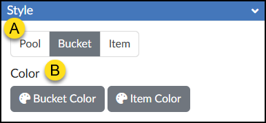
- Tool State (Pool, Bucket, Item): Switch between configuring the overarching Pool, specific Buckets, or individual Items.
- Color: Choose custom colors for your Buckets and Items using the 🎨 Bucket Color and 🎨 Item Color color pickers.
Item
The Item tab (A) is highly context-sensitive. To view its configuration options in the Style panel, two conditions must be met:
- Your Item Type must be set to ‘Text’, ‘Image’, or ‘Image with Caption’ within the Content panel.
- Your cursor must be placed directly inside a specific sortable item within the Rich Content Editor (RCE).
If you click outside of a designated item (such as on the main activity instructions or the bucket background), the settings will hide and display a warning message: “Select an item to edit.”
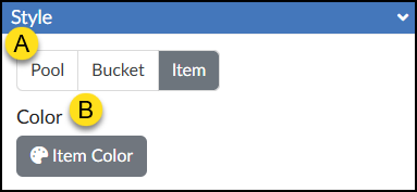
- Tool State (Pool, Bucket, Item): Switch between configuring the overarching Pool, specific Buckets, or individual Items.
- Color: Choose a color for your Item using the 🎨 Item Color color picker.
Advanced Panel
The Advanced panel contains additional settings for your Select All activity that can modify the way it functions for your students.
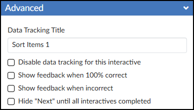
- Data Tracking Title: Enter a custom name to track anonymous usage data for this specific activity. (Review the DesignPLUS Interactive Data guide for more information.)
- ☑️ Disable data tracking for this interactive: Check this box to opt out of collecting anonymous usage data for this specific tool.
- ☑️ Show feedback when 100% correct: Check this box to provide a custom success message. Selecting this adds a green placeholder box in the Rich Content Editor (RCE) where you can type your feedback.
- ☑️ Show feedback when incorrect: Check this box to provide a custom “try again” message. Selecting this adds a red placeholder box in the RCE where you can type your feedback.
- ☑️ Hide “Next” until all interactives completed: Check this box to hide the Canvas “Next” button at the bottom of the page until the student successfully completes the activity.