DesignPLUS Interactive Data

A select number of interactive/engaging tools in the DesignPLUS Sidebar can provide instructors with additional, anonymous data that can be used to see how students are understanding content within a Canvas course.

info

Items of Note

Personal identifiable information (PII) is never linked to the interactive data. All participants remain anonymous. The information is encrypted and displayed as aggregated data.

Furthermore, if students complete interactives via the mobile app, data is not stored in the database. Interactives only work when using a web browser.

Accessing Interactive Data

The Interactive Data tool within the DesignPLUS Sidebar can only be accessed through a Canvas course Settings page.

  1. Log in to a Canvas course.
  2. Click on the Settings link on bottom left-hand corner of the course navigation menu.
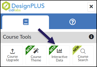
  3. Click on the 🚀 rocket ship icon at the top right corner of the screen to launch the DesignPLUS Sidebar.
    • Alternatively, press the keyboard combination: Alt/Option + Shift + D.
  4. Click on the Interactive Data button.
A screenshot of the DesignPLUS Sidebar, specifically as it appears when viewed from the Canvas "Settings" page. The top of the image shows the DesignPLUS logo and two navigation tabs, with the left tab active. Below this, a panel titled "Course Tools" displays four square buttons in a row: Course Upgrade, Course Theme (with a green Beta ribbon), Interactive Data (also with a green Beta ribbon and a bar chart icon), and Course Search (with a chartreuse New ribbon). A prominent, dark purple arrow points to the "Interactive Data" button, highlighting that this specific tool is only visible when the sidebar is accessed from the "Settings" page.

View Interactive Data Results

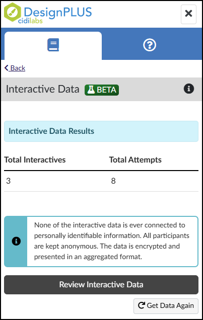
Clicking the Interactive Data button in the DesignPLUS Sidebar opens a summary screen where you have two main options:

  • Review Interactive Data: Click this button to dive deeper into the detailed analytics for all interactive elements used across your course.
  • Get Data Again: Click this button to refresh the “Total Interactives / Total Attempts” table if the numbers seem outdated or incorrect.
A single screenshot of the DesignPLUS Sidebar displaying the 'Interactive Data Results' screen. The standard DesignPLUS header and navigation tabs are visible at the top, along with a 'Back' link. The main content area features a light blue banner titled 'Interactive Data Results.' Below this banner, a simple table displays two metrics: 'Total Interactives,' showing a value of 3, and 'Total Attempts,' showing a value of 8. Following the table is an information box with a teal left border and an 'i' icon, containing text that reads: 'None of the interactive data is ever connected to personally identifiable information. All participants are kept anonymous. The data is encrypted and presented in an aggregated format.' At the bottom, there is a dark grey 'Review Interactive Data' button and a smaller 'Get Data Again' button with a refresh icon.

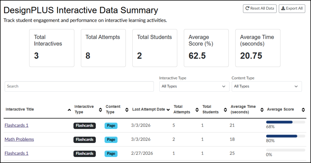
Clicking Review Interactive Data opens a detailed dashboard where you can manage your course’s interactive elements:

  • Global Actions (Top Right):
    • Reset All Data: Permanently clears data for all interactive tools in your course. Warning: This action cannot be undone.
    • Export All: Downloads your data as a CSV file, which includes all table columns except ‘Average Score’.
  • Search and Filter: Use the Search box to look up specific interactives by title, or use the Interactive Type and Content Type dropdown menus to narrow your results.
  • Interactive Data Table: The titles in the first column (Interactive Title) are clickable links. Note: These are the custom names you assigned in the DesignPLUS Advanced panel, not the titles of your Canvas content pages.
A screenshot from the DesignPLUS Sidebar in the Canvas LMS showing the "DesignPLUS Interactive Data Summary" screen. Below the title is the description: "Track student engagement and performance on interactive learning activities." Top-right buttons are "Reset All Data" and "Export All." A row of five key performance indicator tiles shows large numbers for metrics: Total Interactives (3), Total Attempts (8), Total Students (2), Average Score (62.5%), and Average Time (20.75 seconds). Search and filtering options follow, with dropdowns for "Interactive Type" and "Content Type" both set to "All Types." The main content is a detailed data table with column headers for sortable data including interactive titles, type, content type, last attempt date, attempts, students, average time, and average score. The table lists detailed data for specific items: a "Flashcards 1" interactive with a 68% average score, a "Math Problems" interactive with an 80% average score, and another "Flashcards 1" interactive with a 0% average score. Average scores are visually represented by progress bars.

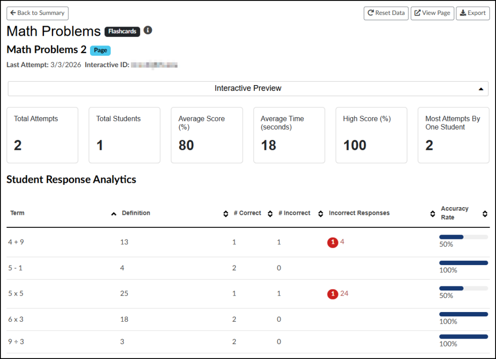
Using the “Math Problems” flashcards as an example, here is a breakdown of the data screen for a specific interactive tool:

  • Header (Top Left): Displays your custom interactive name alongside the Canvas content page title.
  • Action Buttons (Top Right):
    • Reset Data: Permanently clears all data for this specific interactive tool. (Warning: This cannot be undone).
    • View Page: Opens the actual Canvas content page where this interactive tool is located.
    • Export: Downloads the analytics data into a CSV file.
  • Interactive Preview: A dropdown menu that lets you view the interactive element as it appears on the page.
  • Student Response Analytics: A detailed table showing performance metrics for this specific tool. For these input-style flashcards, the table displays the question (Term), the correct answer (Definition), the total Correct/Incorrect counts, specific Incorrect Responses submitted by students, and the overall Accuracy Rate.
A screenshot from the DesignPLUS Sidebar in the Canvas LMS displaying detailed interactive data for a specific 'Flashcards' tool named 'Math Problems' and specifically page item 'Math Problems 2'. The interface includes navigation and control buttons at the top, along with aggregate data cards showing two total attempts by one student, an 80% average score, an 18-second average time, and a high score of 100%. The main body features a detailed 'Student Response Analytics' table with columns for Term, Definition, # Correct, # Incorrect, Incorrect Responses, and Accuracy Rate, listing data for five distinct math operations. For instance, for the term '4 + 9', there is 1 correct attempt and 1 incorrect attempt (response '4') with a 50% accuracy rate, while for '5 - 1', there are 2 correct and 0 incorrect attempts, achieving a 100% accuracy rate. Other terms like '5 x 5' show similar variations in performance data.

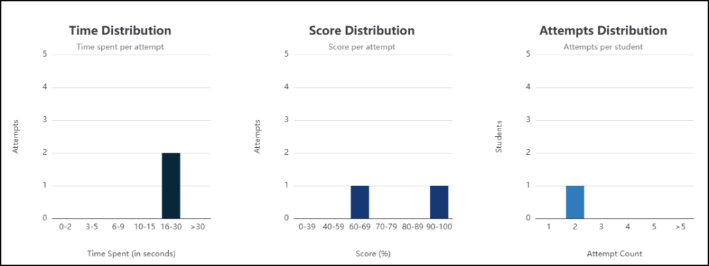
Bar charts will display additional information about the interactive tool such as Time Distribution, Score Distribution, and Attempts Distribution. Hover your mouse cursor over any part of these charts to see more details about the data.

A continuation of the interactive Flashcards data, this image presents three distinct bar charts side-by-side. The leftmost chart, titled 'Time Distribution' and subtitled 'Time spent per attempt,' visualizes attempt frequencies across different time bins in seconds: 0-2, 3-5, 6-9, 10-15, 16-30, and >30, with a single dark bar showing two attempts in the 16-30 second range and zero attempts in all other categories. The middle chart, titled 'Score Distribution' and subtitled 'Score per attempt,' displays attempt counts for percentage score bins: 0-39, 40-59, 60-69, 70-79, 80-89, and 90-100, featuring a dark bar for 60-69% and another for 90-100%, each with a frequency of one attempt. The rightmost chart, titled 'Attempts Distribution' and subtitled 'Attempts per student,' illustrates the number of students associated with specific attempt counts: 1, 2, 3, 4, 5, and >5, indicating with a single light blue bar that one student made exactly two attempts.

Additional Resources