DesignPLUS Flashcards

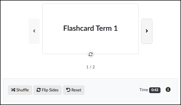
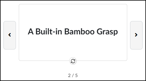
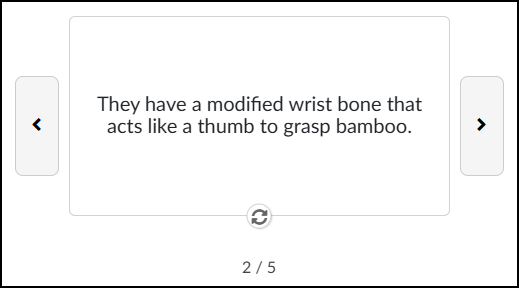
You can create Flashcards on any content page of your Canvas course using the the DesignPLUS Sidebar. Students can use the arrow icons to move from Flashcard to Flashcard. Use the 🔄️ circular arrows icon to flip the Flashcard over to the other side.

Some use cases of Flashcards may include (but are not limited to):

  • Vocabulary and Language Learning: They are perfect for pairing a word in a new language with its native translation, or for learning complex jargon in fields like medicine or law.
  • Memorizing Factual Data: If an answer is absolute and unchanging, it belongs on a Flashcard. This includes historical dates, geographical locations, state capitals, and the periodic table.
  • Formulas and Equations: Flashcards are excellent for drilling math, physics, or chemistry formulas so that you can recall them instantly during an exam.
  • Self-Testing: Using Flashcards helps you quickly identify your knowledge gaps. If you flip the card and don’t know the answer, you immediately know where to focus your study time.
A screenshot of an interactive flashcard study interface, built within Canvas LMS using Cidi Labs' DesignPLUS Sidebar. The main area features a large, rectangular card displaying the text 'Flashcard Term 1'. The card is centered and bordered by a light gray arrow on the left for going backwards and a matching arrow on the right for going forwards. Directly below the card is a circular icon used to flip the flashcard and reveal the other side. Below that, text indicates progress, reading '1 / 2'. A control panel spans the bottom width of the interface, containing three action buttons with icons: 'Shuffle', 'Flip Sides', and 'Reset'. To the right in this panel is text that reads 'Time', followed by a dark badge displaying '0:42', and a small 'info' icon.

Adding Flashcards to a Content Page

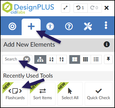
While editing content in your Canvas course, launch the DesignPLUS Sidebar by clicking on the 🚀 rocket ship icon at the top right corner of the screen.

  • Alternatively, press Alt/Option + Shift + D on your keyboard.

Place your cursor in the RCE (Rich Content Editor) where you want to add the Flashcard interface.

In the DesignPLUS Sidebar, click on the ➕ Add New Elements tab.

Click the Flashcards button (found under the Interactive Exercises or Recently Used Tools headings).

  • Alternatively, use the Search textbox to search for Flashcards. DesignPLUS will show results in real-time. Click the ✖️ icon to clear your search.
A screenshot of the Cidi Labs DesignPLUS Sidebar illustrating how to locate the Flashcards tool. Three dark purple arrows highlight key navigation elements: the top arrow points to the 'Add New Elements' tab, represented by a plus sign icon. Below that, a second arrow points to a 'Search' text box, indicating an alternative way to search for the tool. A third arrow points to the 'Flashcards' button itself, which features a code bracket icon and a green 'NEW' sash, located in the 'Recently Used Tools' section.

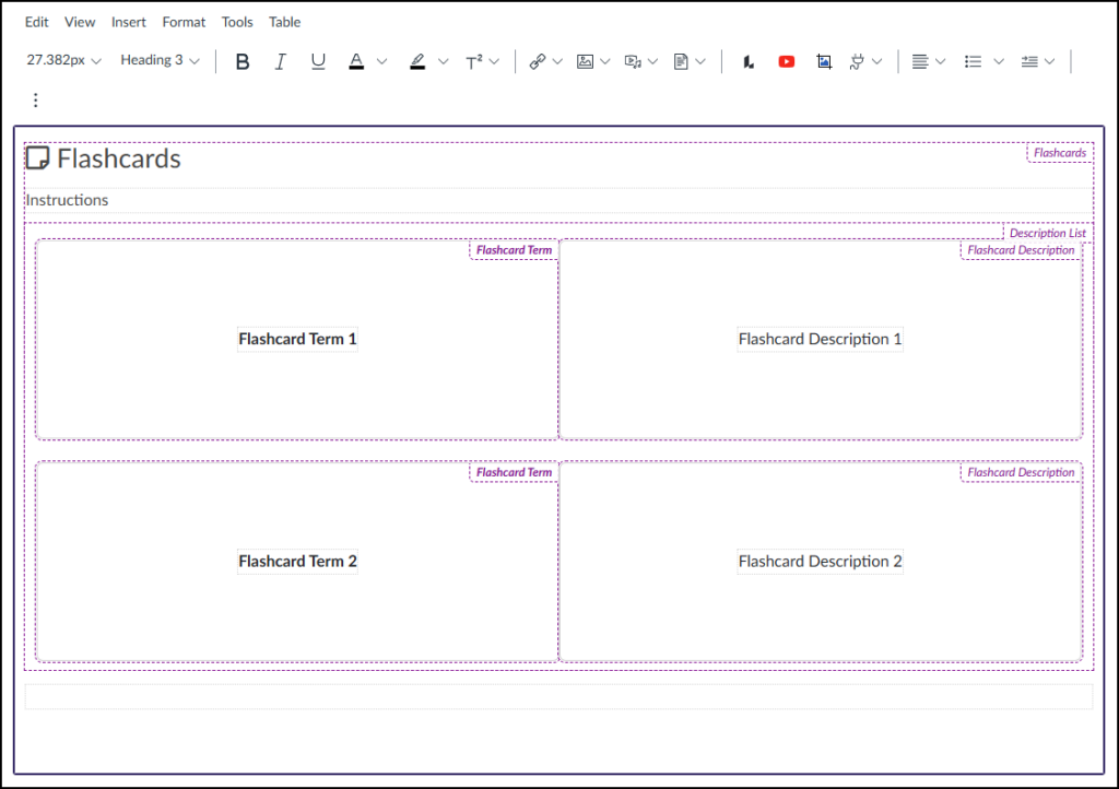
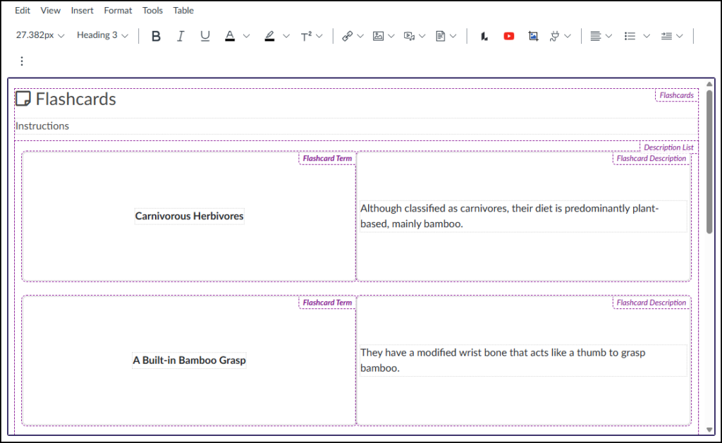
After clicking on the Flashcards button, that interface will be added to the RCE.

  • While editing your content page, the Flashcards interface may not look exactly like what you and your students will see after the page is saved. This is by design.

To edit the front side of your Flashcards (Example: Flashcard Term 1, Flashcard Term 2), refer to the section on Content Panel in this guide.

To edit the back side of your Flashcards (Example: Flashcard Description 1, Flashcard Description 2), place your cursor in those areas within the RCE, and make edits as needed.

A screenshot of the Canvas LMS Rich Content Editor (RCE) interface showing top menus (Edit, View, Insert, Format, Tools, Table) and a standard formatting toolbar. Inserted within the content area is a structured Flashcards tool template, defined by hierarchical dashed purple borders, with the overall container labeled "Flashcards" in the upper right. The layout features an "Instructions" section followed by a "Description List" area containing two rows of side-by-side placeholder content. The first row includes a left box labeled "Flashcard Term" with centered placeholder text "Flashcard Term 1" and an adjacent right box labeled "Flashcard Description" with centered text "Flashcard Description 1". The second row mirrors this setup with "Flashcard Term 2" and "Flashcard Description 2" text in their respective term and description boxes.

Design Assistant Panel

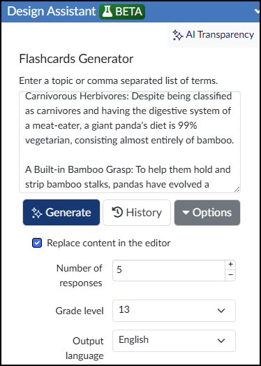
The Design Assistant is currently a beta tool in the DesignPLUS Sidebar. It uses AI (Artificial Intelligence) to generate content that can be inserted into Flashcards. An ✨ AI Transparency link provides additional details and a link to How is Cidi Labs approaching the use of AI?.

After adding Flashcards to your content page, if you do not see the Design Assistant panel within the DesignPLUS Sidebar, you will need to enable beta tools in your Sidebar.

Within the Design Assistant panel, you can use the following tools to set up your Flashcards:

  • Topic Input: Enter a single topic or a comma-separated list of terms into the text box.
  • Generate: Click this button to create your Flashcard content based on your input.
  • History: View a time-stamped log of your previously generated AI content.
  • Options: Adjust your output settings, including the Number of responses, Grade level, Output language, and whether to Replace content in the editor.
A screenshot of the Cidi Lab DesignPLUS Sidebar's Flashcards Generator tool, showing the interface of the "Design Assistant BETA" AI content generation tool. At the top, a blue header is labeled "Design Assistant BETA," with an "AI Transparency" link to its right. The title below reads "Flashcards Generator," followed by an instruction to "Enter a topic or comma separated list of terms". There is a text input field, which contains descriptive sentences about panda biology. Below this field are three buttons with AI symbols: "Generate," "History," and "Options" dropdown. A checkbox labeled "Replace content in the editor" is checked. The tool parameters at the bottom include a field for "Number of responses" set to "5," a "Grade level" dropdown menu set to "13", and an "Output language" dropdown set to "English".

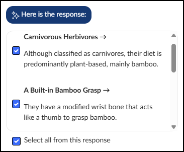
After the Design Assistant generates your content, you can choose exactly what gets added to your Flashcards:

  • To pick specific items: Place a ☑️ checkmark next to the individual results you want to use.
  • To use everything: Place a ☑️ checkmark next to Select all from this response to include the entire batch.
A screenshot showing the response generated by the Design Assistant AI tool within the Cidi Lab DesignPLUS Sidebar. A dark blue banner at the top features a sparkle icon and the text 'Here is the response:'. Below this, a white panel with rounded corners displays preview content for the generated flashcards, accompanied by a scroll bar on the right. The panel contains individual cards, with the first showing a checked checkbox next to the term 'Carnivorous Herbivores' with an arrow, followed by the description 'Although classified as carnivores, their diet is predominantly plant-based, mainly bamboo'. The second card shows a checked checkbox next to the term 'A Built-in Bamboo Grasp' with an arrow, followed by the description 'They have a modified wrist bone that acts like a thumb to grasp bamboo'. At the very bottom, below the preview panel, a checked checkbox is labeled 'Select all from this response'.

Once your Flashcards are generated, you have three options:

  • Add Flashcards: Inserts the generated content directly into the RCE.
  • Start Over: Clears the current results so you can begin a new prompt.
  • Refine results: If you want to adjust the current content, type your feedback into the text box, and click ✨ Refine to generate updated text.
A screenshot shows the interface for the Cidi Lab DesignPLUS Sidebar Flashcards tool. A light blue callout box at the top, featuring an informational icon, contains the text: "Design Assistant content is generated by AI. It should be reviewed for accuracy and edited as needed." Below this box are two prominent buttons: a blue button labeled "Add Flashcards" with an icon of a document and arrow, and a white button labeled "Start Over" with a circular icon. The lower portion of the screen is the "Refine results" section, which includes a label and a large text input box with the placeholder "What would you like to change?". Underneath this input box are two more buttons: a dark blue button labeled "Refine" with a sparkle icon, and a dark gray button labeled "Options" with a dropdown arrow.

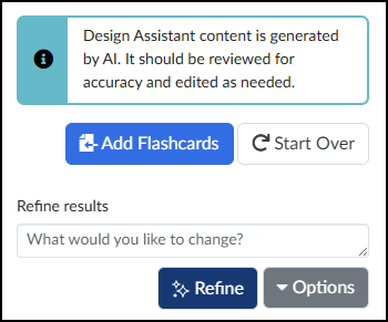
After clicking on the Add Flashcards button, the AI-generated content will be added to the RCE.

A screenshot of the Canvas LMS content editor interface showing a 'Flashcards' block inserted on a page using the Cidi Labs DesignPLUS Sidebar. The central content area features a purple-bordered region with a large purple heading 'Flashcards' next to a page icon, and a section for 'Instructions' with placeholder dotted lines. Below this is a list containing two flashcards. The first card has the term 'Carnivorous Herbivores' and the description 'Although classified as carnivores, their diet is predominantly plant-based, mainly bamboo.'. The second card has the term 'A Built-in Bamboo Grasp' and the description 'They have a modified wrist bone that acts like a thumb to grasp bamboo.'. Various small, dotted purple text labels, such as 'Flashcards', 'Description List', 'Flashcard Term', and 'Flashcard Description', are visible within the purple region, acting as block-type indicators from the DesignPLUS sidebar. Above the editing area, a standard content toolbar is partially visible with formatting controls.

When students view the Flashcards, the interface provides simple, interactive controls:

  • Flip the card: Click the 🔄️ circular arrows icon at the bottom center to reveal the other side.
  • Navigate the deck: Click the < or > buttons to move to the previous or next Flashcard.
A screenshot of an interactive flashcard interface within the Canvas LMS. The central element is a large, white rectangular card prominently displaying the text 'A Built-in Bamboo Grasp'. This main card is flanked by smaller grey rectangular buttons containing a left-facing directional arrow and a right-facing directional arrow. Positioned directly beneath the card is a circular icon of rotating arrows, indicating the function to flip the card. At the very bottom center, a numerical progress indicator reads '2 / 5'.
A screenshot of an interactive flashcard interface within the Canvas LMS. The central element is a large, white rectangular card prominently displaying the text: 'They have a modified wrist bone that acts like a thumb to grasp bamboo.' This main card is flanked by smaller gray rectangular buttons containing a left-facing directional arrow and a right-facing directional arrow. Positioned directly beneath the card is a circular icon of rotating arrows, indicating the function to flip the card. At the very bottom center, a numerical progress indicator reads '2 / 5'.

Content Panel

The Content panel allows you to edit certain properties of your Flashcards.

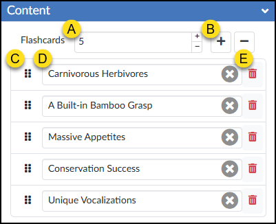
  1. Flashcards: Type a number in the textbox to increase/decrease the number of Flashcards in your set, and press Enter. Increase/Decrease the number of Flashcards using the ➕ / ➖ buttons.
  2. ➕ and ➖: Add or remove a Flashcard.
  3. Move: Click and drag the six vertical dots to move a Flashcard item up/down.
  4. Text: Update the Flashcard name text, or click the ✖️ icon to clear the text completely.
  5. 🗑️ Delete: Remove a Flashcard.
A screenshot of the DesignPLUS Sidebar's "Content" panel for the Flashcards tool, displaying configuration options and a list of five flashcard items annotated with yellow callout letters A through E. The panel features a blue expandable header labeled "Content". In the top control row, callout A points to a numerical input field showing '5' next to the label 'Flashcards', while callout B points to a prominent plus button for adding new cards. Below this is a stacked list containing text input fields for five card terms: 'Carnivorous Herbivores', 'A Built-in Bamboo Grasp', 'Massive Appetites', 'Conservation Success', and 'Unique Vocalizations'. The first item in the list features three specific callouts: callout C points to a vertical grip icon on the far left used for reordering, callout D points to a gray circular button with an 'X' inside the text input field, and callout E points to a red trash can delete icon on the far right.

Style Panel

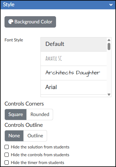
The Style panel of the Flashcards tool allows you to customize the look of your Flashcards.

  • 🎨 Background Color: Set the background color displayed behind the possible answers in your Flashcards activity.
  • Font Style: Select a font style for your Flashcards.
  • Controls Corners: Choose Square or Rounded corners for the control bar at the bottom of the activity (which houses the Shuffle, Flip Sides, and Reset button, and timer).
  • Controls Outline: Select Outline to add a border around the entire Flashcards interface and the bottom control bar, or select None to leave it borderless.
  • ☑️ Hide the solution from students: Check this box to prevent the “Solution” button from appearing after students check their answers. Works in conjunction with the Input Check option in the Advanced panel.
  • ☑️ Hide the controls from students: Check this box to hide the Shuffle, Flip Sides, and Reset buttons, and timer entirely.
  • ☑️ Hide the timer from students: Check this box to hide only the timer in the bottom right corner of the activity.
A screenshot of the DesignPLUS Sidebar Style panel for creating Canvas course flashcards, featuring the blue 'Style' header bar. The panel includes an icon-labeled button for selecting a 'Background Color', followed by a 'Font Style' selection area that shows a scrollable list with visible options including 'Default', and three fonts rendered in their actual style: a thin, all-caps 'AMATIC SC', a script-like 'Architects Daughter', and a clear 'Arial'. Below this, controls for card elements are presented: segmented buttons for 'Controls Corners' with 'Square' (currently selected) and 'Rounded' options, and buttons for 'Controls Outline' with 'None' (currently selected) and 'Outline' options. The panel concludes with three empty checkboxes, each with its respective label: 'Hide the solution from students', 'Hide the controls from students', and 'Hide the timer from students'.

Advanced Panel

The Advanced panel contains additional settings for your Flashcards that can modify the way your Flashcards function for your students.

A screenshot of the DesignPLUS Sidebar 'Advanced' panel for creating Canvas course flashcards. Under the blue 'Advanced' panel, there are three distinct configuration blocks, each with a dark grey header: 'Card Order' features a segmented control with 'Default' (currently selected) and 'Shuffle' buttons, plus a checkbox labeled 'Hide the shuffle button from students'; 'Visible Side' includes buttons for 'Term' (currently selected) and 'Description', along with a checkbox labeled 'Hide the flip sides button from students'; and 'Check Answers' contains buttons for 'None' (currently selected), 'Self-Check', and 'Input Check'. Below these blocks is a 'Data Tracking Title' text input currently displaying 'Flashcards 1', followed by four unchecked boxes with the labels: 'Disable data tracking for this interactive', 'Show feedback when 100% correct', 'Show feedback when incorrect', and 'Hide "Next" until all interactives completed'.
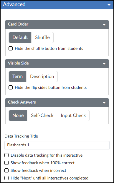
  • Card Order: Select between Default and Shuffle. Optionally, you may ☑️ Hide the shuffle button from students.
  • Visible Side: Select between Term and Description. Optionally, you may ☑️ Hide the flip sides button from students.
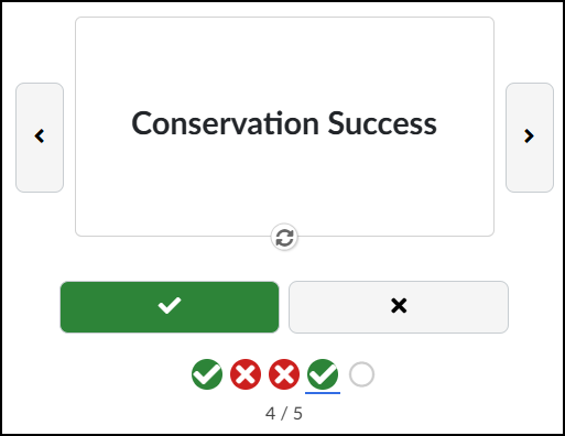
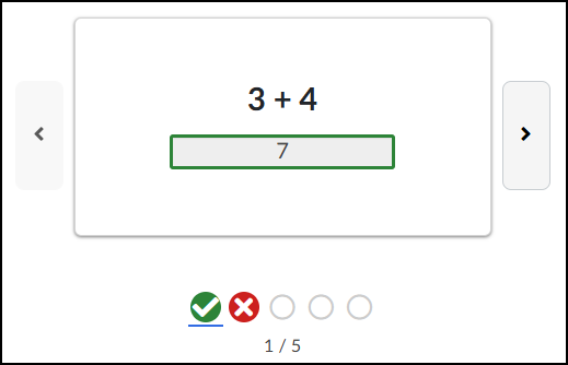
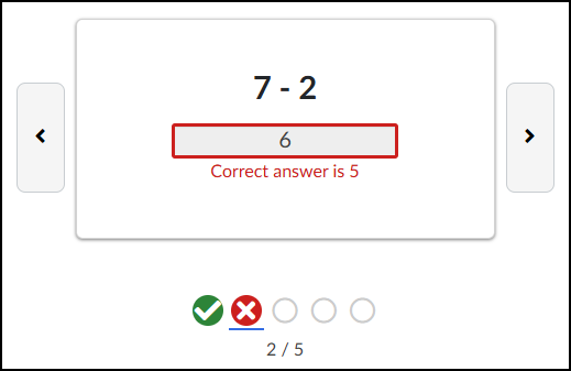
  • Check Answers: Select among None, Self-Check, and Input Check.
Self-Check

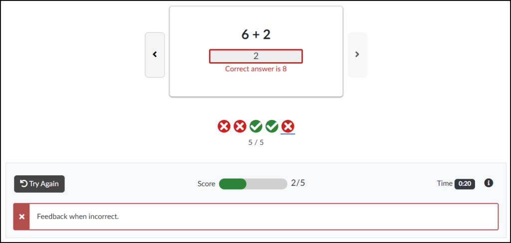
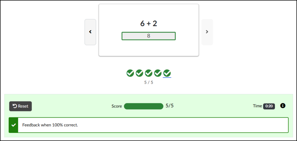
The Self-Check interface adds ✔️ (correct) and ❌ (incorrect) buttons below each Flashcard. As students test their knowledge, they can click the appropriate button to track their accuracy. Their overall progress is displayed directly below these buttons.

Important Note: Self-Check Flashcards are strictly for practice and do not integrate with the Canvas Gradebook.

A screenshot of a DesignPLUS-generated flashcards interface within a Canvas content page. The display features a central main flashcard containing the bold text 'Conservation Success', flanked by left and right navigation buttons. A circular flip icon is located below the main text. Below this, a 'Self-Check' interface consists of two large buttons: a solid green button on the left with a white checkmark icon and a light grey button on the right with a black X icon. A row of small circular status indicators follows left to right: a green checkmark, two red X icons, a second green checkmark that is underlined in blue, and a grey-outlined unfilled circle. The text '4 / 5' at the bottom of the interface indicates the current progress.
Input Check

  • Data Tracking Title: Enter a custom name to track anonymous usage data for this specific activity. (Review the DesignPLUS Interactive Data guide for more information.)
  • ☑️ Disable data tracking for this interactive: Check this box to opt out of collecting anonymous usage data for this specific tool.
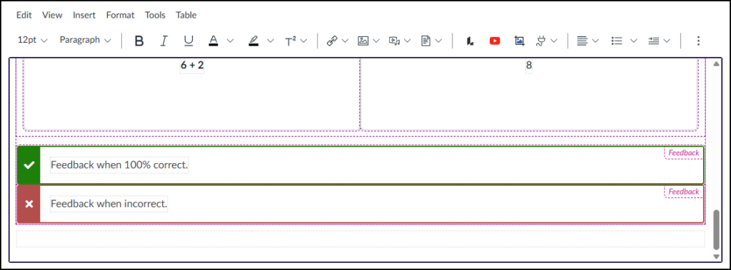
  • ☑️ Show feedback when 100% correct: Check this box to provide a custom success message. Selecting this adds a green placeholder box in the Rich Content Editor (RCE) where you can type your feedback.
  • ☑️ Show feedback when incorrect: Check this box to provide a custom “try again” message. Selecting this adds a red placeholder box in the RCE where you can type your feedback.
A detailed screenshot from the DesignPLUS Flashcards tool within the Canvas LMS editor displays an expanded view of an editing interface for a specific math problem. Within an expanded grey-purple container, a math problem is visible with "6 + 2" on the left and a box containing "8" on the right. Directly below this problem, specifically configured for feedback, are two color-coded rows. The upper row is dark green with a white checkmark icon on the left, containing a text field with the placeholder text 'Feedback when 100% correct.' and a small magenta dashed label box with the word 'Feedback' in its upper-right corner. The lower row is red with a white 'X' icon on the left, holding a text field with the placeholder text 'Feedback when incorrect.' and a similar magenta dashed label box, also marked 'Feedback'. This view confirms the placement and content of the spaces provided to add correct and incorrect feedback for the Input Check flashcard interaction.
  • ☑️ Hide “Next” until all interactives completed: Check this box to hide the Canvas “Next” button at the bottom of the page until the student successfully completes the activity.

From a student perspective, correct or incorrect feedback will look similar to the following:

Correct Feedback
Incorrect Feedback

If a student does not get all questions correct, he/she will see your custom feedback message in a red area below the Flashcards.

A Try Again button returns all questions as unanswered. It does not keep track of questions that were answered correctly.

A screenshot of a Canvas LMS content page shows the completed final state of an incorrect interactive math flashcard sequence, demonstrating the incorrect feedback display for the Input Check feature. The central flashcard area displays the math problem '6 + 2' above a red-outlined input field containing the incorrect response '2'. Directly beneath this field, red text explicitly states, 'Correct answer is 8'. Previous and next navigation chevrons flank the main card. Below the card, a progress track of five icons shows two red X's, two green checkmarks, and a fifth red X with a blue underline indicating this last incorrect card, and centered text reading '5 / 5'. At the bottom, a detailed feedback panel contains a grey 'Try Again' button with a reset icon. Next to it is a 'Score' section with a progress bar and text '2/5', a timer showing 'Time 0:20', and an information icon. The panel includes a text box marked by a red 'X' which displays the generic configured feedback message: 'Feedback when incorrect.'.

Additional Resources