Fill-in-the-Blank interactive questions can be added to content pages within your course. These can be used as a self-check for your students. However, there is no connection to the Canvas Gradebook.
- Adding a Fill-in-the-Blank to a Content Page
- Content Panel
- Style Panel
- Advanced Panel
- Additional Resources
Adding a Fill-in-the-Blank to a Content Page
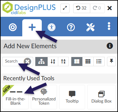
While editing content in your Canvas course, launch the DesignPLUS Sidebar by clicking on the 🚀 rocket ship icon at the top right corner of the screen.
- Alternatively, press Alt/Option + Shift + D on your keyboard.
Place your cursor in the RCE (Rich Content Editor) where you want to add the Fill-in-the-Blank interface.
In the DesignPLUS Sidebar, click on the ➕ Add New Elements tab.
Click the Fill-in-the-Blank button (found under the Interactive Exercises, Page Information, or Recently Used Tools headings).
- Alternatively, use the Search textbox to search for Fill-in-the-Blank. DesignPLUS will show results in real-time. Click the ✖️ icon to clear your search.
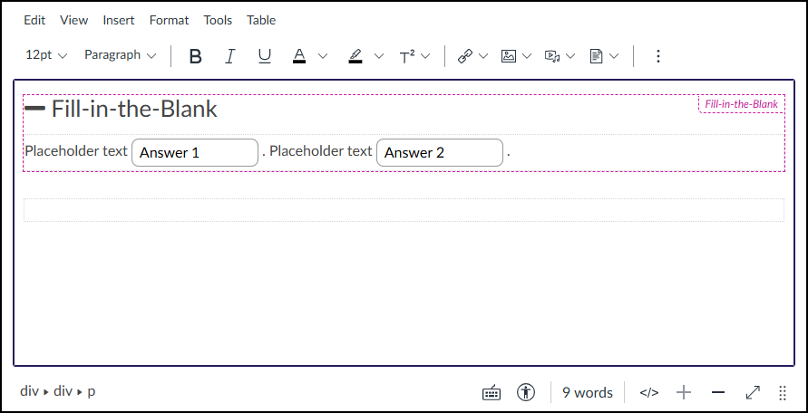
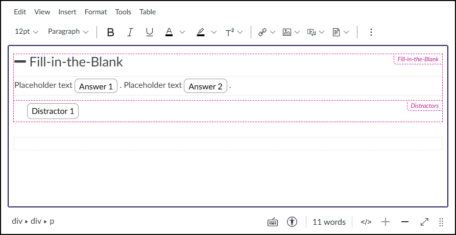
After clicking on the Fill-in-the-Blank button, that interface will be added to the RCE.
Keep in mind the following as you make edits:
- The Fill-in-the-Blank interface may not look exactly like what you and your students will see after the page is saved. This is by design.
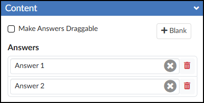
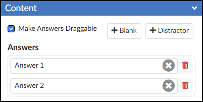
- The Content Panel in the DesignPLUS Sidebar provides tools to fully manage the answers below your question. You can use it to:
- Add or remove answer blanks
- Make answers dragable
- All text shown below can be edited directly in the RCE, but it is highly recommended you use the Content Panel to edit the answer blanks. (Example: Answer 1, Answer 2)
Content Panel
The Content panel for Fill-in-the-Blank questions contains two main areas:
- The Answers section provides textboxes where you can define the correct response for each blank space in the Rich Content Editor (RCE). You can manage your answer blanks using the following controls:
- Clear text: Click the ❌ icon to remove all text from a specific textbox.
- Delete a blank: Click the 🗑️ trashcan icon to completely remove an answer blank from your question.
- Add a blank: Click the ➕ Blank button to insert a new blank into your question. The blank will appear wherever your cursor was last placed in the RCE.
- The ☑️ Make Answers Draggable checkbox activates an additional button, ➕ Distractor, in the Content panel.
Any Distractors (incorrect options) you add will appear just below the Answers in the Content panel. Type the incorrect choices you want students to see into these textboxes. Just like the Answers section, you can manage your distractors using the following controls:
- Clear text: Click the ❌ icon to remove all text from a distractor textbox.
- Delete a distractor: Click the 🗑️ trashcan icon to completely remove that distractor from your question.
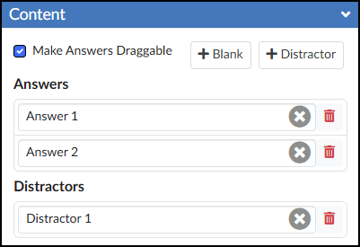
In the RCE, Distractors are displayed underneath the text. (Example: Distractor 1)
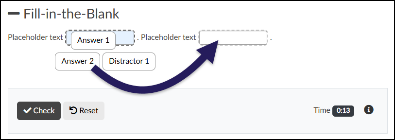
When no Distractors are provided, the activity functions as a standard text-entry fill-in-the-blank. Students will need to type their own responses into each blank and click the ✔️ Check button to see if they are correct.
![A screenshot of a "Fill-in-the-Blank" interactive question displayed on a Canvas content page. The question begins with a heading, "— Fill-in-the-Blank", followed by a sentence structure featuring two empty text input fields integrated within placeholder text: "Placeholder text [empty text field]. Placeholder text [empty text field].". A separate, light grey rectangular interaction area below the question contains a dark grey "Check" button with a checkmark icon and a light grey "Reset" button with a counter-clockwise arrow icon on the left side. On the right side of this area, the text "Time" precedes a dark digital timer display showing "0:00", and the section concludes with a small, dark-circled information ("i") icon.](http://campus.collegeforcreativestudies.edu/ed-tech/wp-content/uploads/sites/53/2026/03/DesignPLUS_FillInTheBlank_StudentView1.png)
When Distractors are used, students must click and drag the available options into the corresponding blanks. Afterward, they can click the ✔️ Check button to see if their answers are correct.
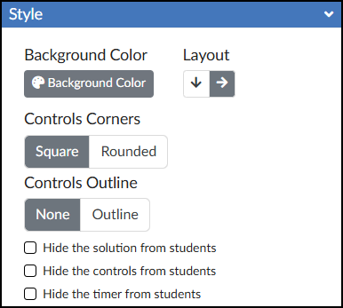
Style Panel
The Style panel of the Fill-in-the-Blank tool allows you to customize the look of your Fill-in-the-Blank content.
- 🎨 Background Color: Set the background color displayed behind the possible answers in your Fill-in-the-Blank activity.
- This option is only available if “Make Answers Draggable” has been selected from the Content panel.
- Layout: Select between ⬇️ Vertical Layout or ➡️ Horizontal Layout.
- This option is only available if “Make Answers Draggable” has been selected from the Content panel.
- Controls Corners: Choose Square or Rounded corners for the control bar at the bottom of the activity (which houses the ✔️ Check button, Reset button, and timer).
- Controls Outline: Select Outline to add a border around the entire Fill-in-the-Blank interface and the bottom control bar, or select None to leave it borderless.
- ☑️ Hide the solution from students: Check this box to prevent the “Solution” button from appearing after students check their answers.
- ☑️ Hide the controls from students: Check this box to hide the ✔️ Check button, Reset button, and timer entirely.
- ☑️ Hide the timer from students: Check this box to hide only the timer in the bottom right corner of the activity.
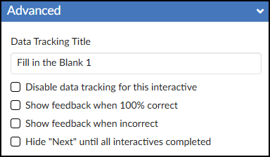
Advanced Panel
The Advanced panel contains additional settings for your Flashcards that can modify the way your Flashcards function for your students.
- Data Tracking Title: Enter a name if you would like to track anonymous data about the Fill-in-the-Blank interactive tool.
- Review DesignPLUS Interactive Data for additional information.
- ☑️ Disable data tracking for this interactive: Select this checkbox if you do not want to view anonymous data about the Flashcards interactive tool.
- ☑️ Show feedback when 100% correct: Create a custom message for your students. A green box will display in the RCE for you to edit the feedback text.
- ☑️ Show feedback when incorrect: Create a custom message for your students. A red box will display in the RCE for you to edit the feedback text.
- ☑️ Hide “Next” until all interactives completed: This option hides the “Next” button that normally appears at the bottom right corner of a Canvas page. The “Next” button appears once the interactive has been completed.