You can use the DesignPLUS Sidebar to add accordions, expanders, and tabs layouts to your course. Some use examples include (but are not limited to):
- Chunk content: Keep page lengths short and manageable for you and your students.
- Organize FAQs: Create interactive Frequently Asked Questions sections.
- List steps: Break down detailed instructions for graded assignments.
- Adding an Accordion, Expander, or Tabs to a Content Page
- Design Assistant Panel
- Content Panel
- Style Panel
- Advanced Panel
- Additional Resources
Adding an Accordion, Expander, or Tabs to a Content Page
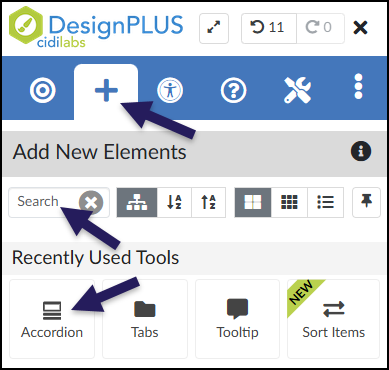
While editing content in your Canvas course, launch the DesignPLUS Sidebar by clicking on the 🚀 rocket ship icon at the top right corner of the screen.
- Alternatively, press Alt/Option + Shift + D on your keyboard.
Place your cursor in the RCE (Rich Content Editor) where you want to add the accordion, expander, or tabs interface.
In the DesignPLUS Sidebar, click on the ➕ Add New Elements tab.
Click the Accordion, Expander, or Tabs button (found under the Page Layout, Interactive, or Recently Used Tools headings).
- Alternatively, use the Search textbox to search for Accordion, Expander, or Tabs. DesignPLUS will show results in real-time. Click the ✖️ icon to clear your search.
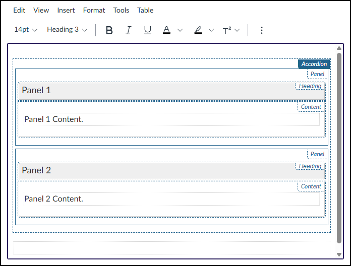
After clicking on the Accordion, Expander, or Tabs button, that interface will be added to the RCE.
- While editing your content page, the accordion, expander, or tab interface may not look exactly like what you and your students will see after the page is saved. This is by design.
To edit names of the panel headings (Example: Panel 1, Panel 2), refer to the section on Content Panel in this guide.
To edit the content within each panel (Example: Panel 1 Content, Panel 2 Content), place your cursor in those areas within the RCE, and make edits as needed.
Design Assistant Panel
The Design Assistant is currently a beta tool in the DesignPLUS Sidebar. It uses AI (Artificial Intelligence) to generate content that can be inserted into accordions, expanders, and tabs layouts. An ✨ AI Transparency link provides additional details and a link to How is Cidi Labs approaching the use of AI?.
After adding an accordion, expander, or tabs layout to your content page, if you do not see the Design Assistant panel within the DesignPLUS Sidebar, you will need to enable beta tools in your Sidebar.
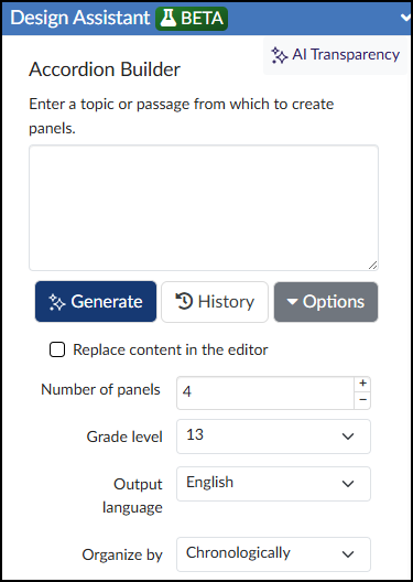
These two side-by-side screenshots are taken from the DesignPLUS Accordion Builder section of the Design Assistant. However, the Expander Builder and Tabs Builder interfaces are nearly identical.
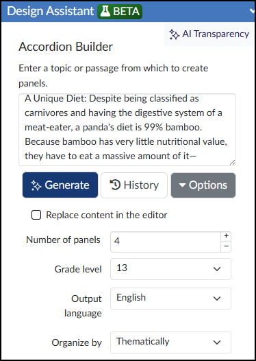
In the Design Assistant panel, enter a topic or passage from which to create accordion, expander, or tabs panels.
- Click the Generate button to generate panel content.
- Click the History button to see previous AI-generated content that is date and time stamped.
- Click the Options button to see additional options: Replace content in the editor, Number of panels, Grade level, Output language, and Organize by.
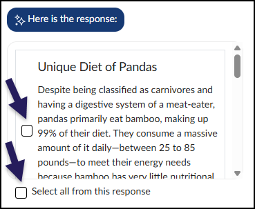
The Design Assistant will display AI-generated content based on the content provided and options selected. Place a ☑️ checkmark next to those items you wish to include in your accordion, expander, or tabs layout. Place a ☑️ checkmark next to Select all from this response to include all AI-generated content in the layout.
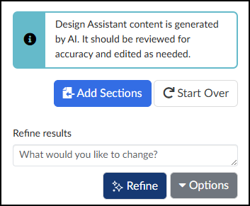
Click the Add Sections button to add the AI-generated content in an accordion, expander, or tabs layout within the RCE.
If you need to further refine your content, use the Refine results textbox to provide more details, and then click the ✨ Refine button.
After clicking on the Add Sections button, the AI-generated content will be added to the RCE.
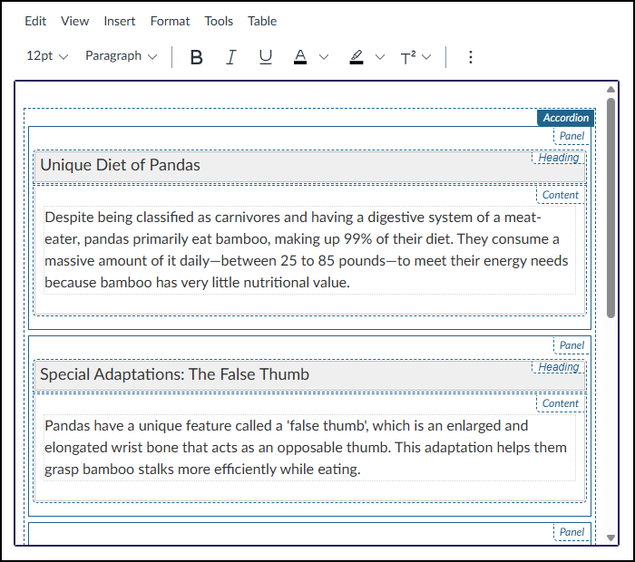
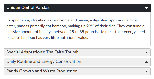
When the content page is saved, the accordion or expander layout may look similar to below screenshot.
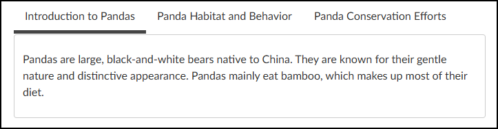
The Tabs interface may look similar to the below screenshot. Depending on your selections, tabs will appear either above or to the left of the content.
Content Panel
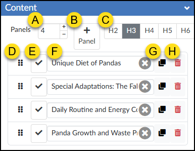
The Content panel allows you to edit certain properties of your accordion, expander, or tabs layout.
- Panels: Increase or decrease the number of accordion, expander, or tabs panels using the ➕ / ➖ buttons.
- ➕Panel: Add an additional accordion, expander, or tabs panel.
- Heading Level: Change the heading level.
- Move: Click and drag the six vertical dots to move a panel item up/down.
- ✔️ Check: Set a panel to open by default.
- Text: Update the panel name text, or click the ✖️ icon to clear the text completely.
- Duplicate: Make a copy of a given panel.
- 🗑️ Delete: Remove a panel (and the content within it) from your accordion, expander, or tabs.
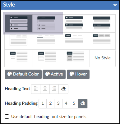
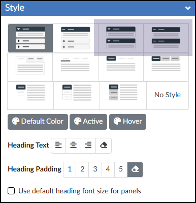
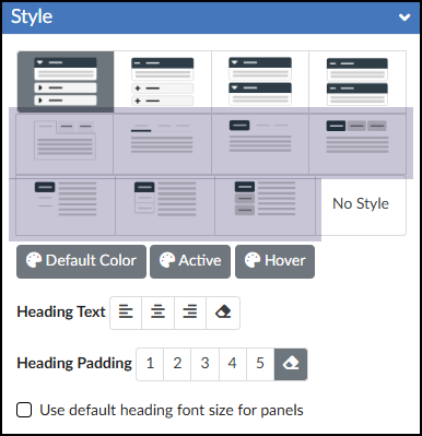
Style Panel
The Style panel allows you to choose from a handful of styles for your accordion, expander, or tabs layout.
Click on the tabs below to learn more about each type.
- Basic Tabs
- Underlined Tabs
- Pill Tabs
- Button Tabs
- Pill Tabs Vertical
- Pill Tabs Vertical Outlined
- Button Tabs Vertical
Using a tabs interface on a Canvas page is one of the most effective ways to organize content and improve the student experience. From an instructional design perspective, tabs are excellent for “chunking” information, which prevents the dreaded “wall of text” and reduces cognitive load.
- Organizing Content by Format: Grouping different types of learning materials so students can easily find what they need. For example, you might use tabs labeled Readings, Lectures, and Supplemental Resources.
- Sequencing Steps in an Assignment: Breaking down a large, complex project into manageable phases. Your tabs could be labeled Step 1: Brainstorm, Step 2: Rough Draft, and Step 3: Final Submission.
- Providing Differentiated Instruction: Offering alternative learning paths or technical instructions based on student needs. You might have tabs for Beginner Concepts and Advanced Deep Dives, or Mac Instructions and Windows Instructions.
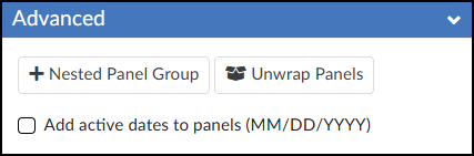
Advanced Panel
The Advanced panel includes a few additional options:
- ➕ Nested Panel Group: Add additional accordions, expanders, or tabs inside existing accordions, expanders, or tabs. Take care when using this option, as nesting content within content can get messy. Due to accessibility considerations, you may only nest panel groups one level deep.
- Unwrap Panels: Unwraps the accordion, expander, or tabs interface.
- Add active dates to panels (MM/DD/YYYY): Adds dates to your accordion, expander, or tabs layout in the RCE. Set the start and end dates that you want the panels to open/close automatically.