Popovers are an excellent tool for keeping your course pages clean and streamlined. They allow you to hide additional content until a user clicks a linked word or phrase.
Here is how they compare to similar tools:
- Vs. Tooltips: Popovers require a click rather than a hover, and they can include rich media like images and videos, not just text.
- Vs. Dialog Boxes: Popovers do not use a ‘lightbox’ effect, meaning they won’t dim the rest of your screen when opened.
Adding a Popover to a Content Page
You can add as many Popovers as needed to a content page within your Canvas course.
While editing content in your Canvas course, launch the DesignPLUS Sidebar by clicking on the 🚀 rocket ship icon at the top right corner of the screen.
- Alternatively, press Alt/Option + Shift + D on your keyboard.
Within your paragraph of text, highlight the word or phrase you would like to make as a Popover.
- Alternatively, place your cursor within a paragraph of text at the point where you want to insert the Popover.
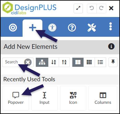
In the DesignPLUS Sidebar, click on the ➕ Add New Elements tab.
Click the Popover button (found under the Interactive Content or Recently Used Tools headings).
- Alternatively, use the Search textbox to search for Popover. DesignPLUS will show results in real-time. Click the ✖️ icon to clear your search.
Content Panel
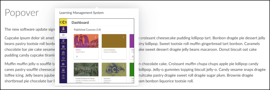
In the following example, when a student clicks on the acronym LMS, a Popover appears displaying the words “Learning Management System” and an image of the Canvas Learning Management System Dashboard.
![A screenshot of a web page example titled "Popover", showing how the tool is used to create an interactive link within course content. The central focus is a sentence that reads, "The new software update significantly improves the [LMS] response time." A dark purple arrow points directly to the bracketed abbreviation "[LMS]". This visual highlights "[LMS]" as the interactive phrase which, when clicked by a user, would display the popover's additional content. The surrounding placeholder text is visible below.](http://campus.collegeforcreativestudies.edu/ed-tech/wp-content/uploads/sites/53/2026/03/DesignPLUS_Popover_StudentView1-1024x313.png)
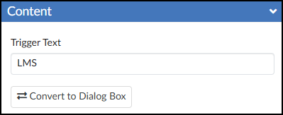
It is highly recommended to use the Content panel to make any updates to your Popovers. This panel provides a dedicated textbox to safely edit the Trigger Text.
- Trigger Text: The visible word or phrase that students click on.
- 🔁 Convert to Dialog Box: Convert the Popover to the Dialog Box tool.
After editing the text in the Content panel, press Enter on your keyboard or click anywhere outside the text box to update the Canvas Rich Content Editor (RCE).
Inside the Canvas RCE, locate the light gray area tagged with Popover Content. You can use this space to add any text, images, videos, or other media you want to display in your Popover.
![A screenshot of the Canvas Rich Content Editor in edit mode, demonstrating the DesignPLUS Popover tool applied to text on a content page. The line of text, 'The new software update significantly improves the [Popover LMS] response time,' shows 'LMS' as the popover trigger, marked by a grey label. Positioned directly below the sentence is a large, dedicated content box for this popover, distinguished by a dark grey label 'Popover Content' and the title 'Learning Management System'. This box contains an embedded screenshot of a Canvas dashboard with various course cards, representing the rich content that will pop up when a user interacts with the 'LMS' trigger in the final, published view.](http://campus.collegeforcreativestudies.edu/ed-tech/wp-content/uploads/sites/53/2026/03/DesignPLUS_Popover_EditInRCE.png)
Save or Save & Publish your content page to test out the Popover.