Dialog Boxes are interactive pop-ups that appear when a user clicks a specific word or phrase. They are an excellent tool for keeping your course pages clean and streamlined.
- Visual Focus: They use a “lightbox” effect, dimming the main screen to highlight the newly opened content box.
- An alternative to the Dialog Box is the Popover.
- Extra Context: They allow you to provide on-demand access to supplementary details—including lengthy text, images, videos, or other media—without cluttering your main page design.
Adding a Dialog Box to a Content Page
You can add as many Dialog Boxes as needed to a content page within your Canvas course.
While editing content in your Canvas course, launch the DesignPLUS Sidebar by clicking on the 🚀 rocket ship icon at the top right corner of the screen.
- Alternatively, press Alt/Option + Shift + D on your keyboard.
Within your paragraph of text, highlight the word or phrase you would like to make as a Dialog Box.
- Alternatively, place your cursor within a paragraph of text at the point where you want to insert the Dialog Box.
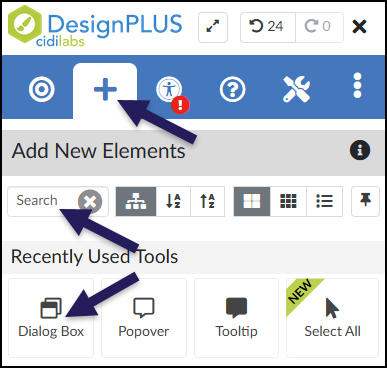
In the DesignPLUS Sidebar, click on the ➕ Add New Elements tab.
Click the Dialog Box button (found under the Interactive Content or Recently Used Tools headings).
- Alternatively, use the Search textbox to search for Dialog Box. DesignPLUS will show results in real-time. Click the ✖️ icon to clear your search.
Content Panel
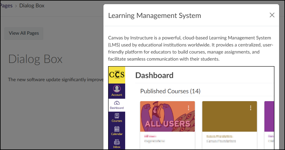
In the following example, when a student clicks on the acronym LMS, a Dialog Box appears displaying a short paragraph and image of the Canvas Learning Management System Dashboard.
![A student-facing view of a Canvas content page, titled with a large heading "Dialog Box" in a gray font, displays a single sentence of text: "The new software update significantly improves the [purple and underlined link] LMS response time." Within this sentence, the acronym "LMS" is clearly formatted as an active, purple, underlined hyperlink. This view shows the static state of the page as a student first encounters it, where the purple hyperlink serves as the interactive trigger. Clicking this link is the action that would activate the associated Dialog Box content, which is the tool being demonstrated. The background is clean and white, with no tooltips or other interface elements visible.](http://campus.collegeforcreativestudies.edu/ed-tech/wp-content/uploads/sites/53/2026/03/DesignPLUS_DialogBox_StudentView1.png)
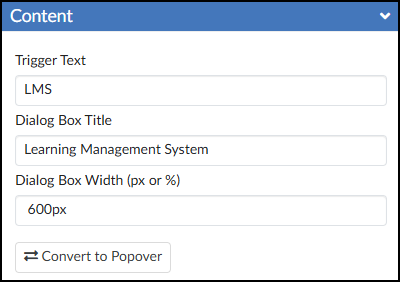
It is highly recommended to use the Content panel to make any updates to your Dialog Box(es). This panel provides dedicated textboxes to safely edit specific parts of the tool:
- Trigger Text: The visible word or phrase that students click on.
- Dialog Box Title: The title that displays at the top of the dialog box for you and your students.
- Dialog Box Width (px or %): Set the width of the dialog box in either pixels (px) or percentage (%).
- 🔁 Convert to Popover: Convert the Dialog Box to the Popover tool.
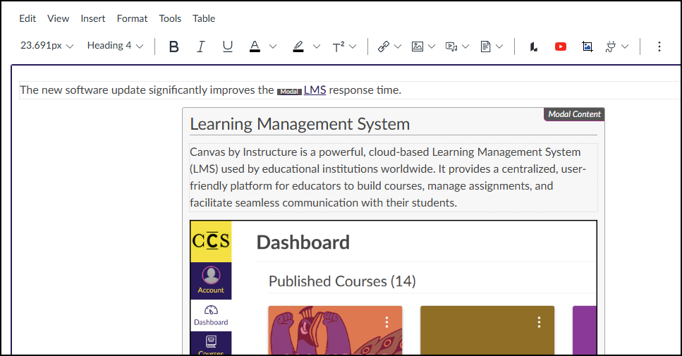
After editing the text in the Content panel, press Enter on your keyboard or click anywhere outside the text box to update the Canvas Rich Content Editor (RCE).
Inside the Canvas RCE, locate the light gray area tagged with Modal Content. You can use this space to add any text, images, videos, or other media you want to display in your Dialog Box.
Save or Save & Publish your content page to test out the Dialog Box.