Tooltips are small, interactive pop-up boxes that appear when users hover their cursor over a specific word or phrase. They are an excellent way to provide students with quick definitions, helpful hints, or extra context without cluttering your page design. By using tooltips, you can keep your course content clean and streamlined while ensuring learners have immediate access to the clarifying details they need.
Tooltips support plain text only and cannot be used with other elements such as icons or images. If you wish to include these elements, consider using Dialog Boxes or Popovers instead.
Adding a Tooltip to a Content Page
You can add as many Tooltips as needed to a content page within your Canvas course.
While editing content in your Canvas course, launch the DesignPLUS Sidebar by clicking on the 🚀 rocket ship icon at the top right corner of the screen.
- Alternatively, press Alt/Option + Shift + D on your keyboard.
Within your paragraph of text, highlight the word or phrase you would like to make as a Tooltip.
- Alternatively, place your cursor within a paragraph of text at the point where you want to insert the Tooltip.
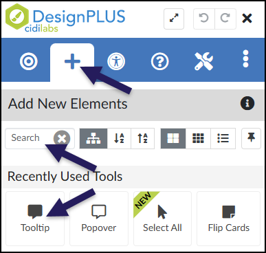
In the DesignPLUS Sidebar, click on the ➕ Add New Elements tab.
Click the Tooltip button (found under the Interactive Content or Recently Used Tools headings).
- Alternatively, use the Search textbox to search for Tooltip. DesignPLUS will show results in real-time. Click the ✖️ icon to clear your search.
Content Panel
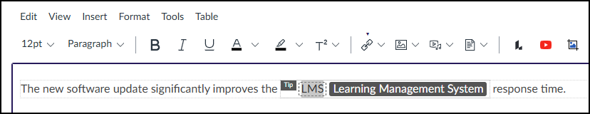
In the following example, when a student hovers over the acronym LMS, a Tooltip appears displaying the full phrase Learning Management System.
![An example of an active tooltip within a sentence. Below the heading "Tooltip," the text reads: "The new software update significantly improves the [highlighted] LMS response time." Floating above the acronym "LMS" is a black pop-up bubble containing the text: "Learning Management System."](http://campus.collegeforcreativestudies.edu/ed-tech/wp-content/uploads/sites/53/2026/03/DesignPLUS_TooltipExample.png)
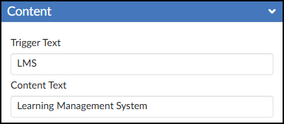
It is highly recommended to use the Content panel to make any updates to your Tooltips. This panel provides dedicated textboxes to safely edit both parts of the tool:
- Trigger Text: The visible word or phrase that students hover over.
- Content Text: The hidden message or definition that pops up.
After editing the text in the Content panel, press Enter on your keyboard or click anywhere outside the text box to update the Canvas Rich Content Editor (RCE).
Save or Save & Publish your content page to test out the Tooltip.