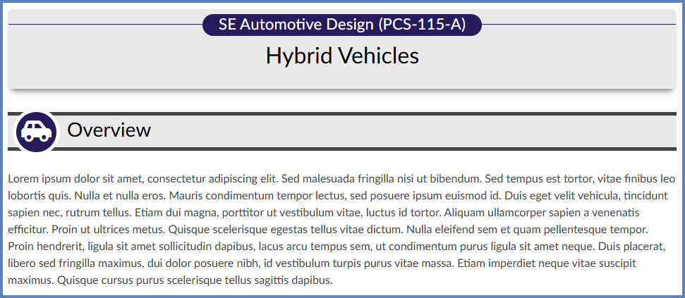
You can create a content page in Canvas from scratch using the DesignPLUS sidebar. In this Guide, we will design a basic themed content page that includes a banner and a content block to keep your page organized. An example of a basic page created with DesignPLUS might look something like this:
Add a Theme with a Banner Title
- Create a brand new page in your Canvas course.
- While editing the page, click on the 🚀 rocket ship icon at the top right-hand corner of the screen to open the DesignPLUS sidebar.
- Alternatively, use the keyboard shortcut Alt/Option + Shift + D.
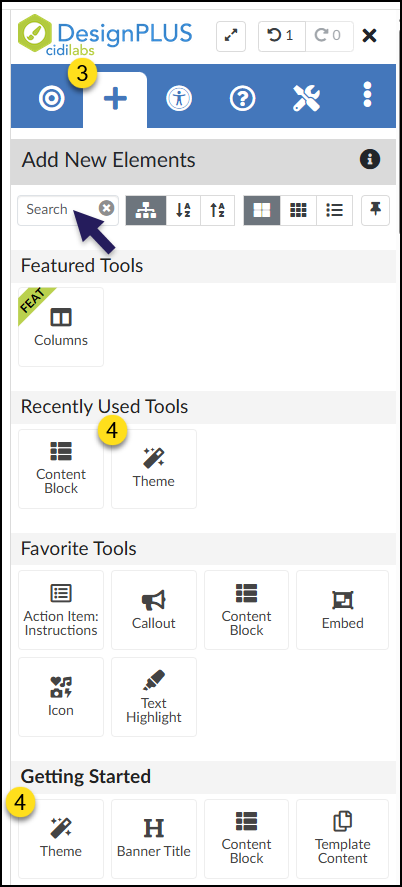
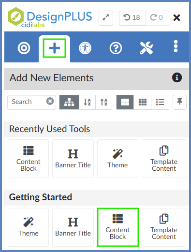
- On the top blue toolbar of the DesignPLUS sidebar, click on the ➕ Add New Elements tab.
- Under the heading Getting Started, click on the Theme button. This will add a banner in the Rich Content Editor (RCE) that you can apply a theme to.
- The Theme button may also show up under the heading Recently Used Tools if you have recently used this tool to build content. If this is your first time using the DesignPLUS sidebar, the Recently Used Tools heading most likely will not display on your screen until you have used one or more tools from the sidebar.
- You can also use the Search text box to type in the word Theme. This will allow you to quickly find the button in the DesignPLUS sidebar.
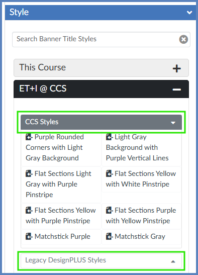
- Below the Content panel, click on the Style panel to open it.
- Expand any of the categories available to you by clicking on the ➕ icon to expand the panel. Hover over any style to get a preview of what it would look like on your page. When you find one that you like, click on it to apply the style to your banner. If you don’t like the way that style looks on the page, select another one.
- 2024 Themes and 2025 Themes contain themes designed by fellow DesignPLUS users from around the world.
- CCS [Color] Themes contain themes designed by members of the CCS ET+I team, organized by dominant color within the theme.
- Legacy Themes contain themes designed by Cidi Labs when their Design Tools (now DesignPLUS) product was first developed.
- My Custom Themes contain themes that you have developed in your own course. (This panel may or may not show in your view.)
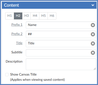
- Once you have chosen a style for your Theme, the banner for that theme appears in the RCE. For the banner, it is recommended that you edit the text directly in the DesignPLUS sidebar. In the Content panel that appears in the DesignPLUS sidebar, fill in the information about your page. Any information you add to these text fields will automatically populate on your page within the RCE. For example:
- Prefix 1: Your course name
- Prefix 2: Your course number
- Title: The title of your page
- Subtitle and Description: Both of these are optional
- The Show Canvas Title checkbox would display the native page title at the top of your page when you save it. If you include the title of your page in the Title field shown below, it is not necessary to check this box.
Add a Content Block
- In the Rich Content Editor (RCE), place your cursor underneath the banner you’ve created.
- On the top blue toolbar of the DesignPLUS sidebar, click on the ➕ Add New Elements icon.
- Under the heading Getting Started, click on the Content Block button. This will add a content block element to your new page.
- The Content Block button may also show up under the heading Recently Used Tools if you have recently used this tool to build content. If this is your first time using the DesignPLUS sidebar, the Recently Used Tools heading most likely will not display on your screen until you have used one or more tools from the sidebar.
- You can also use the Search text box to type in the words Content Block. This will allow you to quickly find the button in the DesignPLUS sidebar.
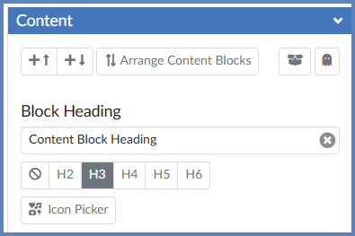
- Once you have added a Content Block to your page, it is recommended that you edit the heading for that Content Block directly in the DesignPLUS sidebar. In the Content panel that appears in the DesignPLUS sidebar, fill in the Block Heading textbox. Any information you add to this text field will automatically populate on your page within the RCE. For example, your heading might be the word “Overview” where you will provide an overview of the page you are designing. Or, your heading might be the words “Helpful Websites” where you will list several websites about a topic for your students to access. The possibilities are endless.
- Click on the Icon Picker button to select an icon you’d like to use with your Content Block.
At this point, your Content Block still looks pretty plain, so let’s add some style to it.
- In the RCE, place your cursor within the Content Block.
- On the top blue toolbar of the DesignPLUS sidebar, click on the 🎯 Edit Current Element tab.
- Click on the Text button below the 🎯 Edit Current Element tab.
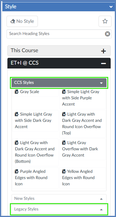
- Click on the Style panel to open it.
- Expand any of the categories available to you by clicking on the ➕ icon to expand the panel. Hover over any style to get a preview of what it would look like on your page. When you find one that you like, click on it to apply the style to your banner. If you don’t like the way that style looks on the page, select another one.
- 2024 Headings contain themes designed by fellow DesignPLUS users from around the world.
- CCS [Color] Styles contain themes designed by members of the CCS ET+I team, organized by dominant color within the theme.
- Legacy Themes contain themes designed by Cidi Labs when their Design Tools (now DesignPLUS) product was first developed.
- Miscellaneous Headings contain styles that don’t really fit any of the other categories. (This panel may or may not show in your view.)
- In the RCE, fill in the contents of your page with information that your students will need (text, website links, videos, documents, etc.)
- Be sure to Save your content page.
Additional Resources
DesignPLUS: Create a Basic Page
DesignPLUS: Themes
DesignPLUS: Content Blocks
Create a New Page in a Course